- Typography, Web, Experiment
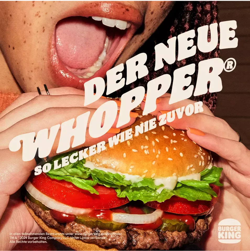
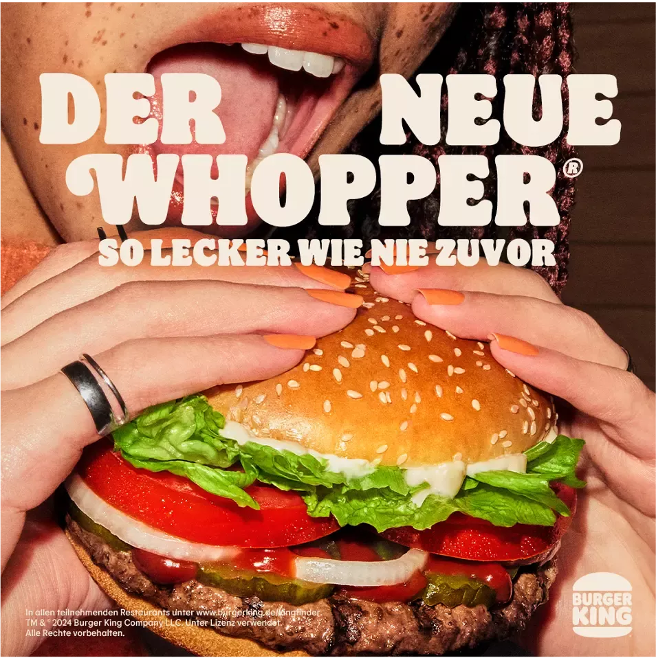
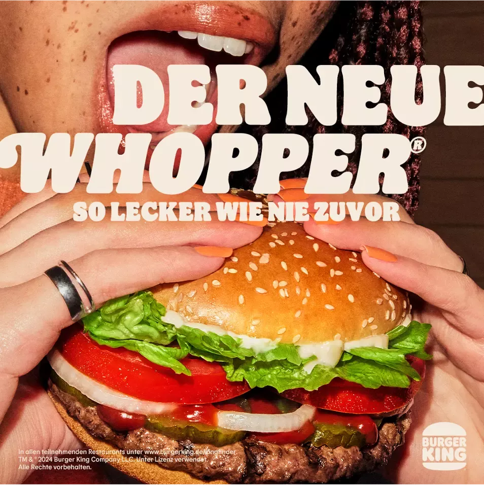
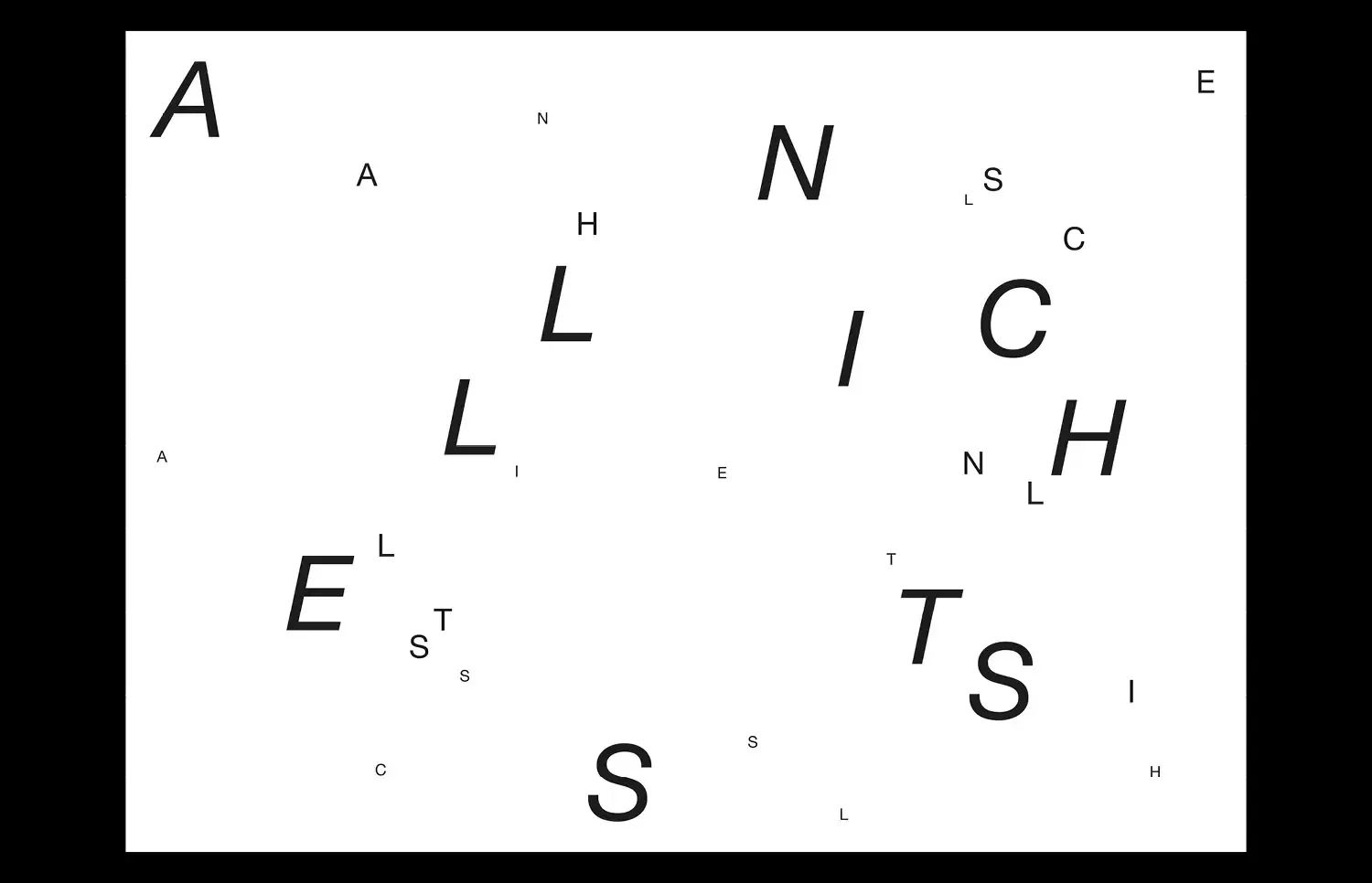
Experimental typo layout design for social media assets for Burger King for David+Martin. Some other themes and designs have been created in the areas of social media assets, meta ads (formats), app coupons and also website asset customizations.
- Typography, Experiment, Fashion, Print
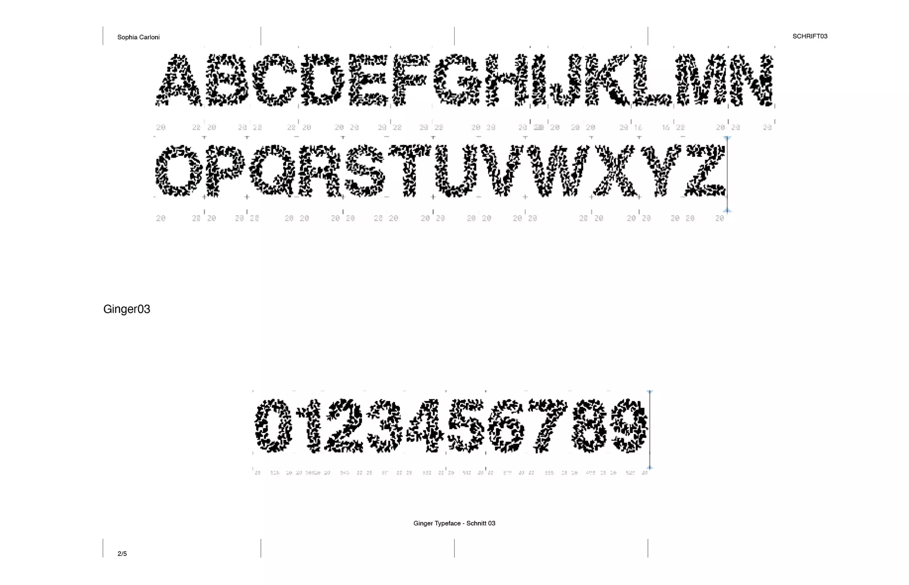
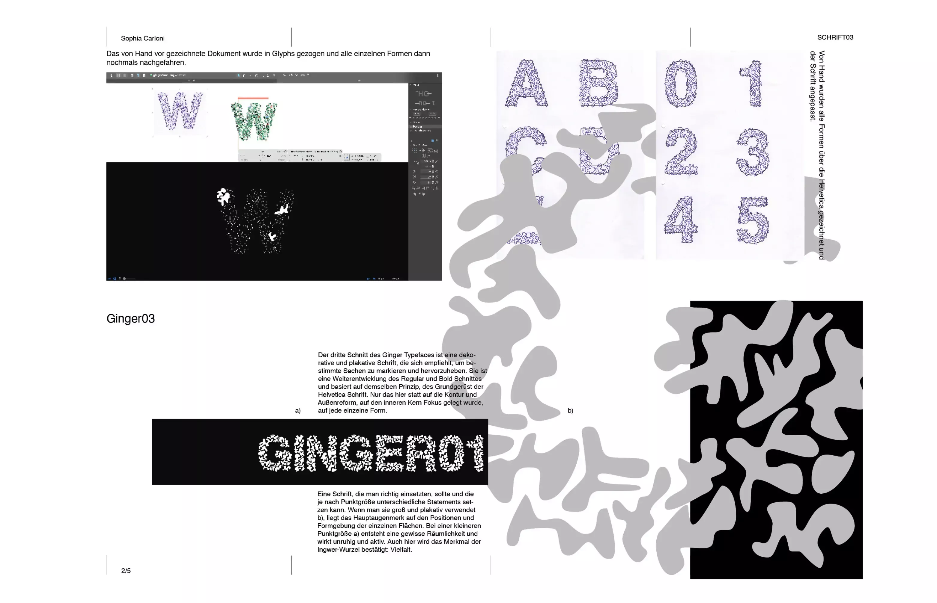
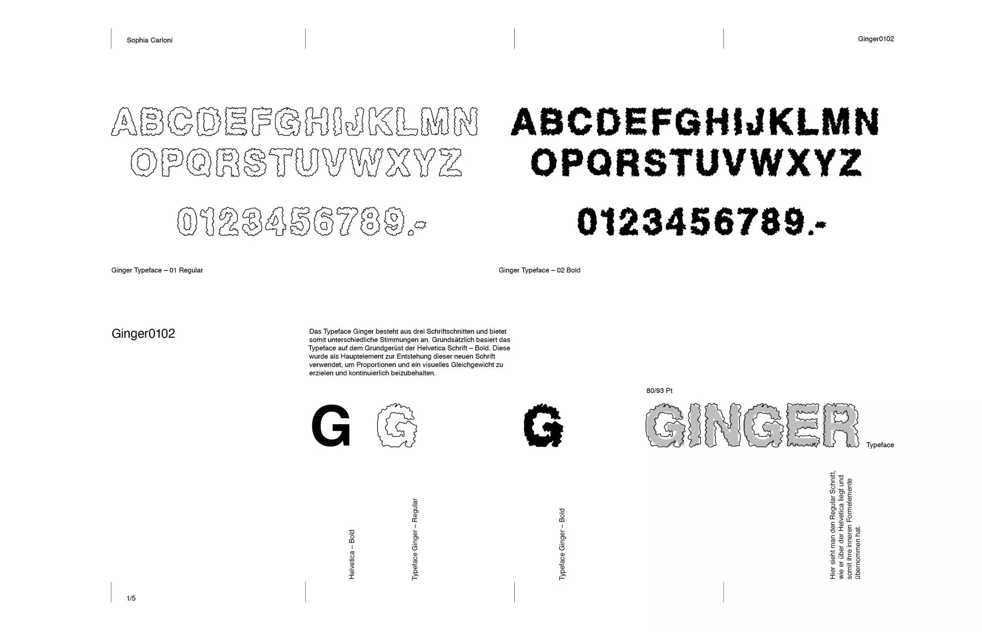
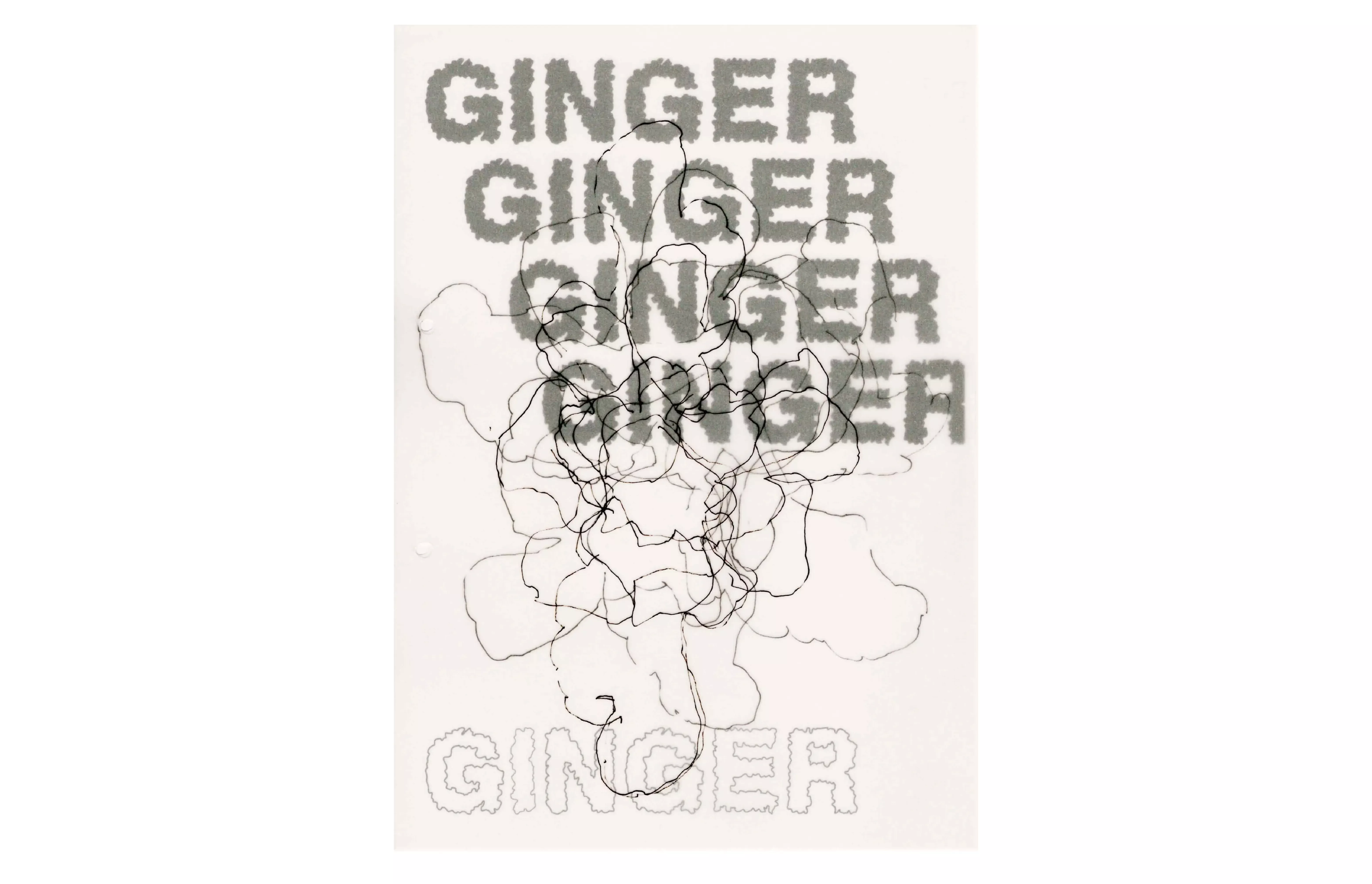
Inspired by a piece of ginger, this typeface was created. The different forms. The different shapes, arrangements, contours, areas, and the basic structure of Helvetica have given rise to this typography.
- Typography
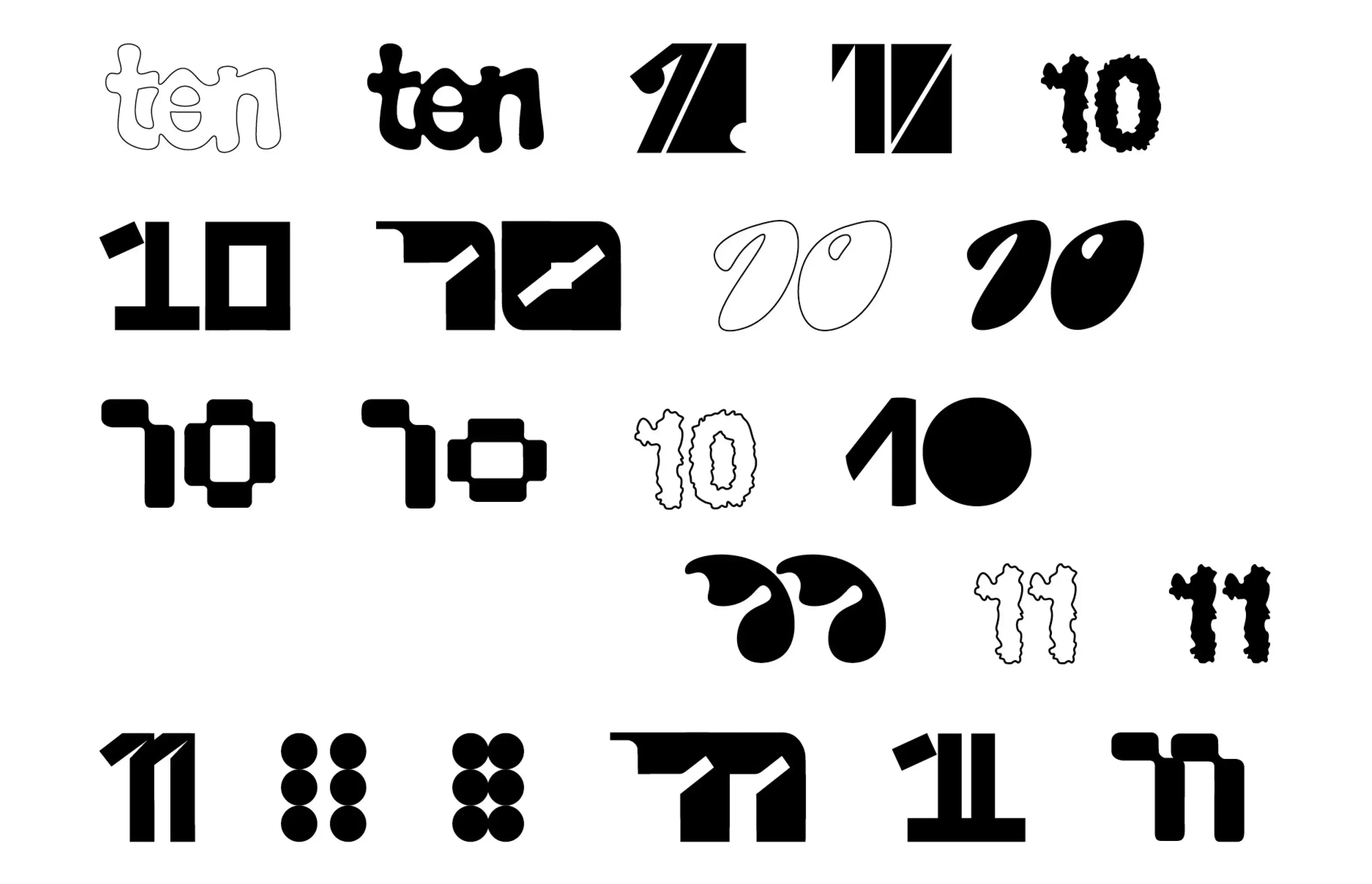
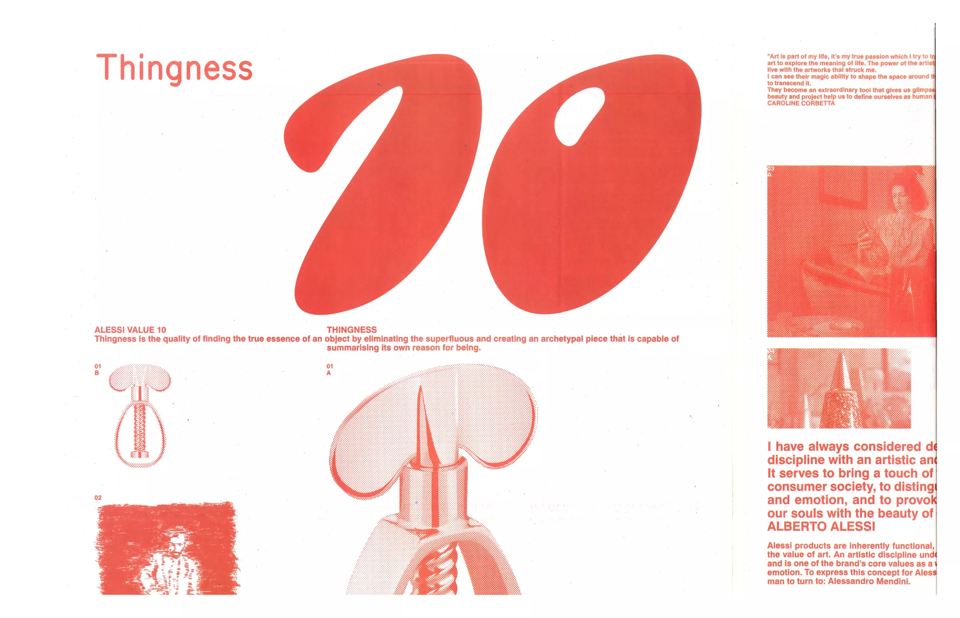
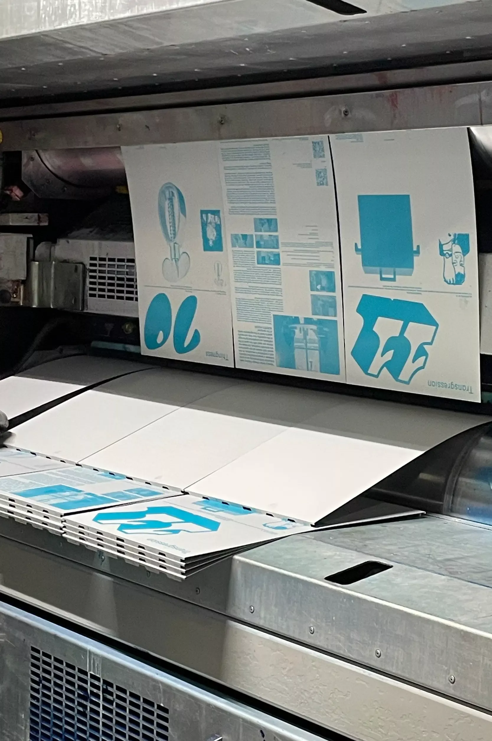
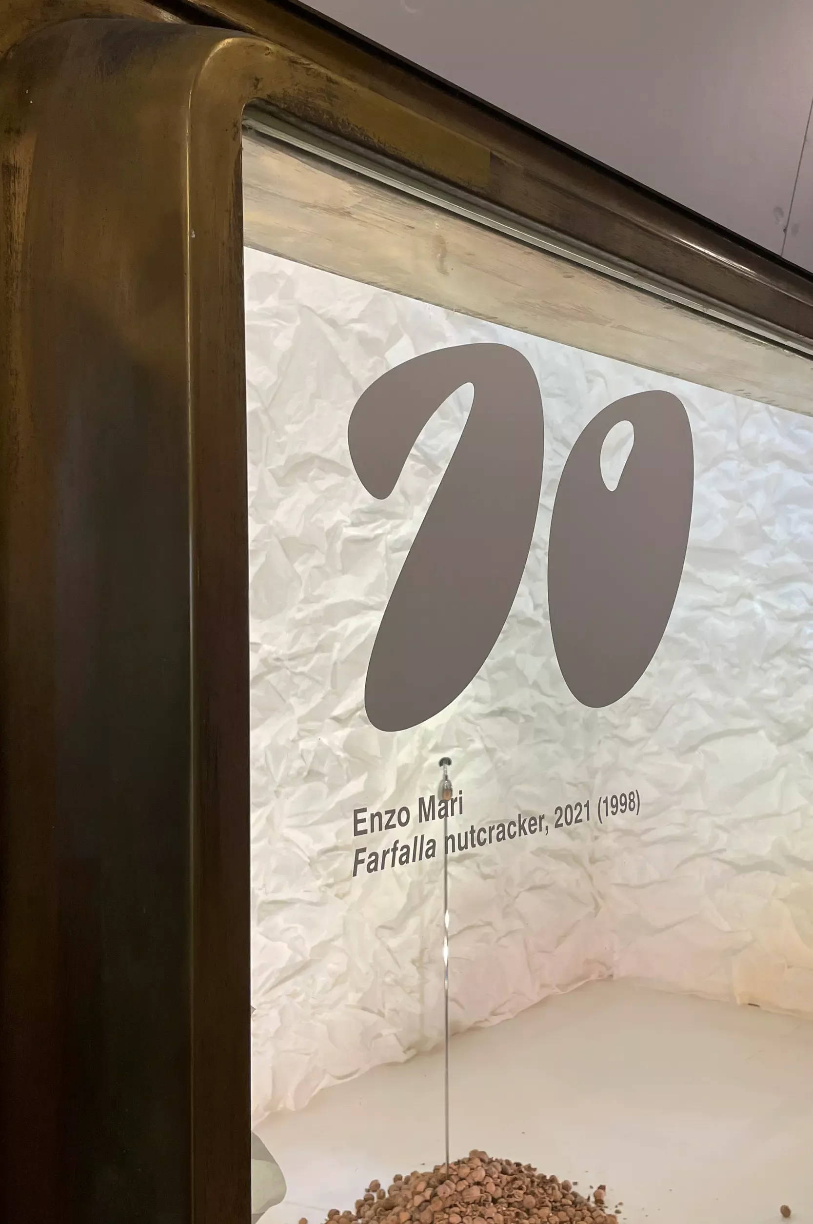
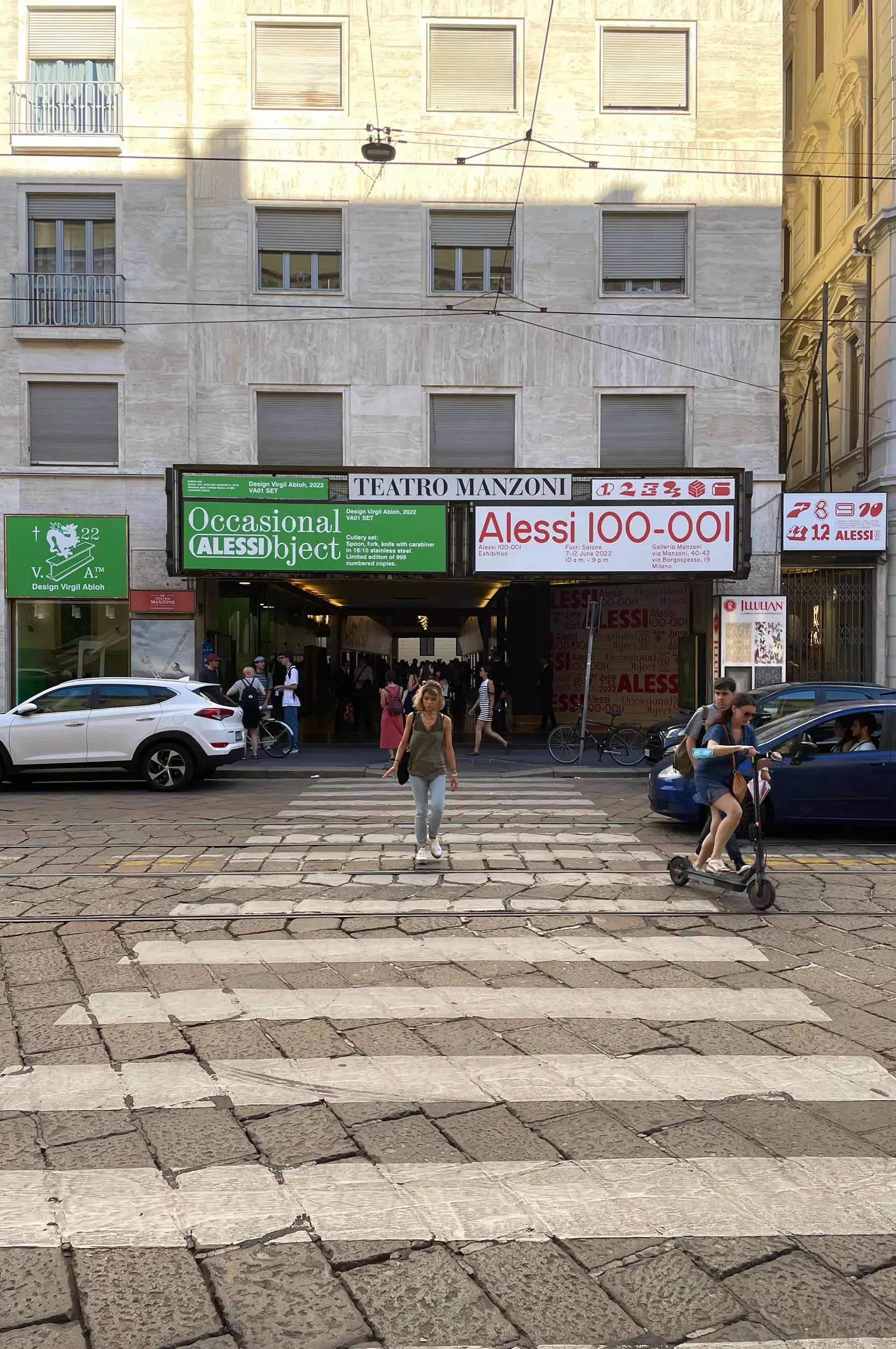
The design of the number 10 for Studio Temp for Design week 2022 at the showroom Alessi 100-001.
- Print, Fashion, Typography, Experiment
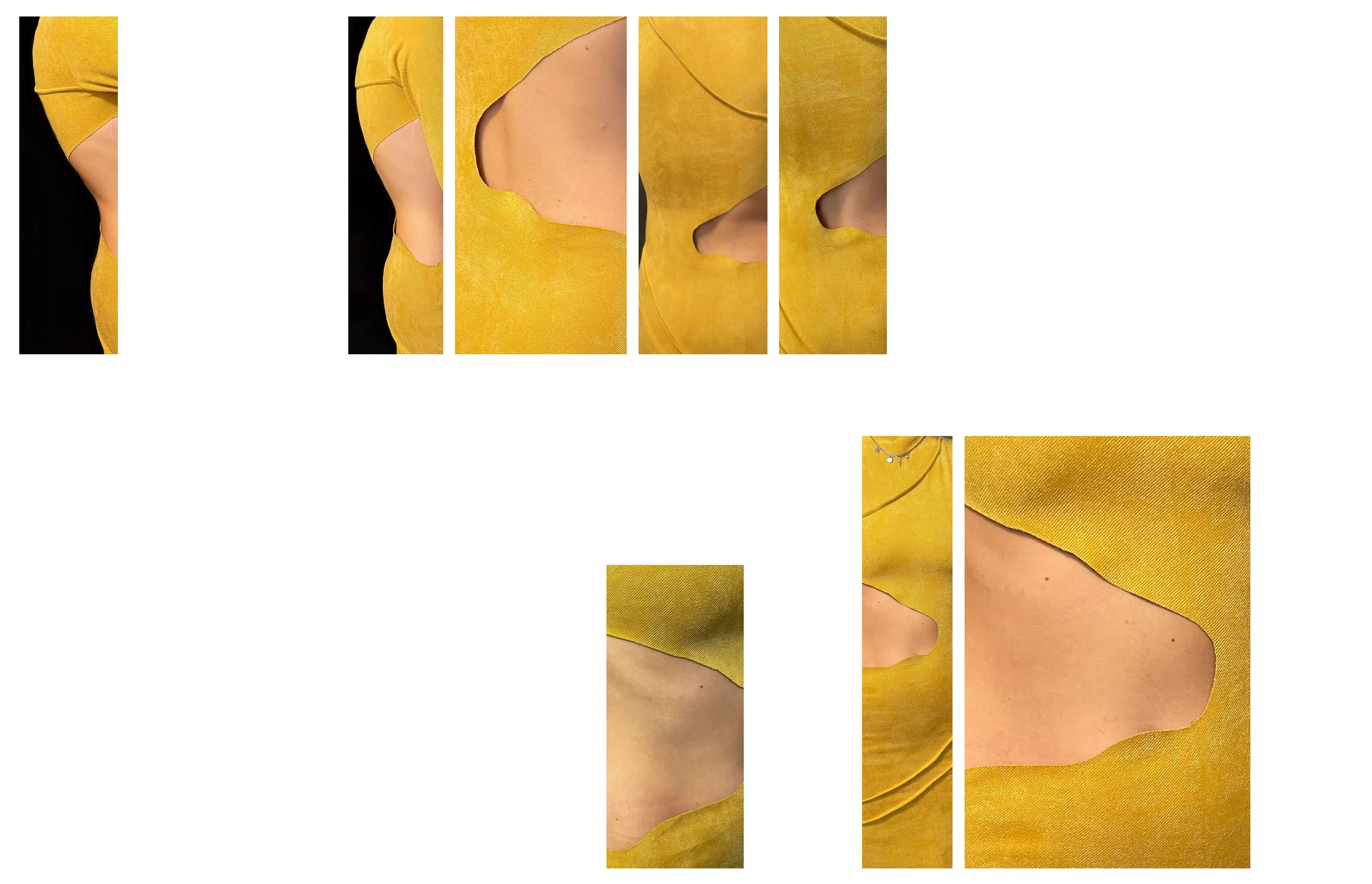
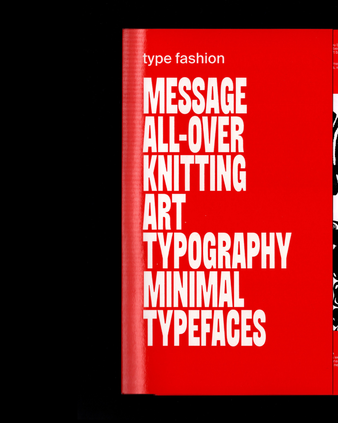
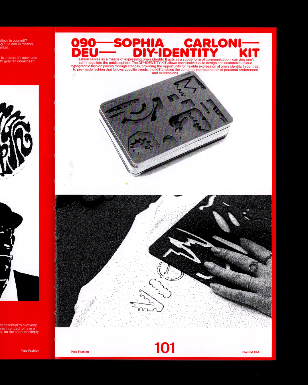
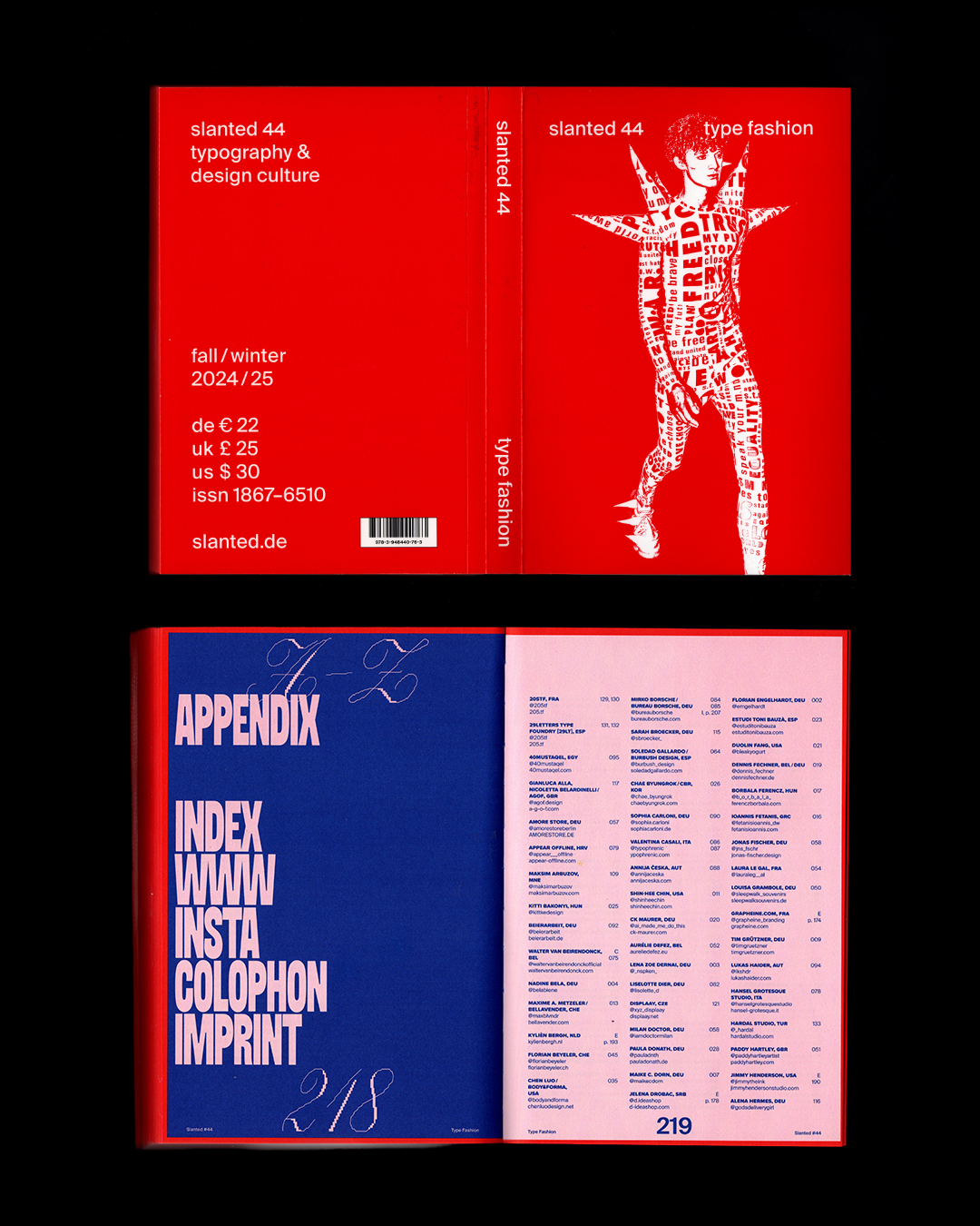
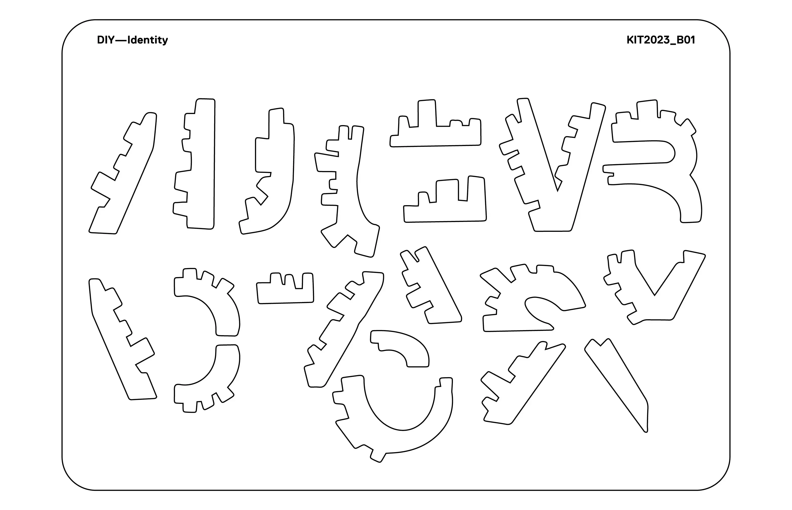
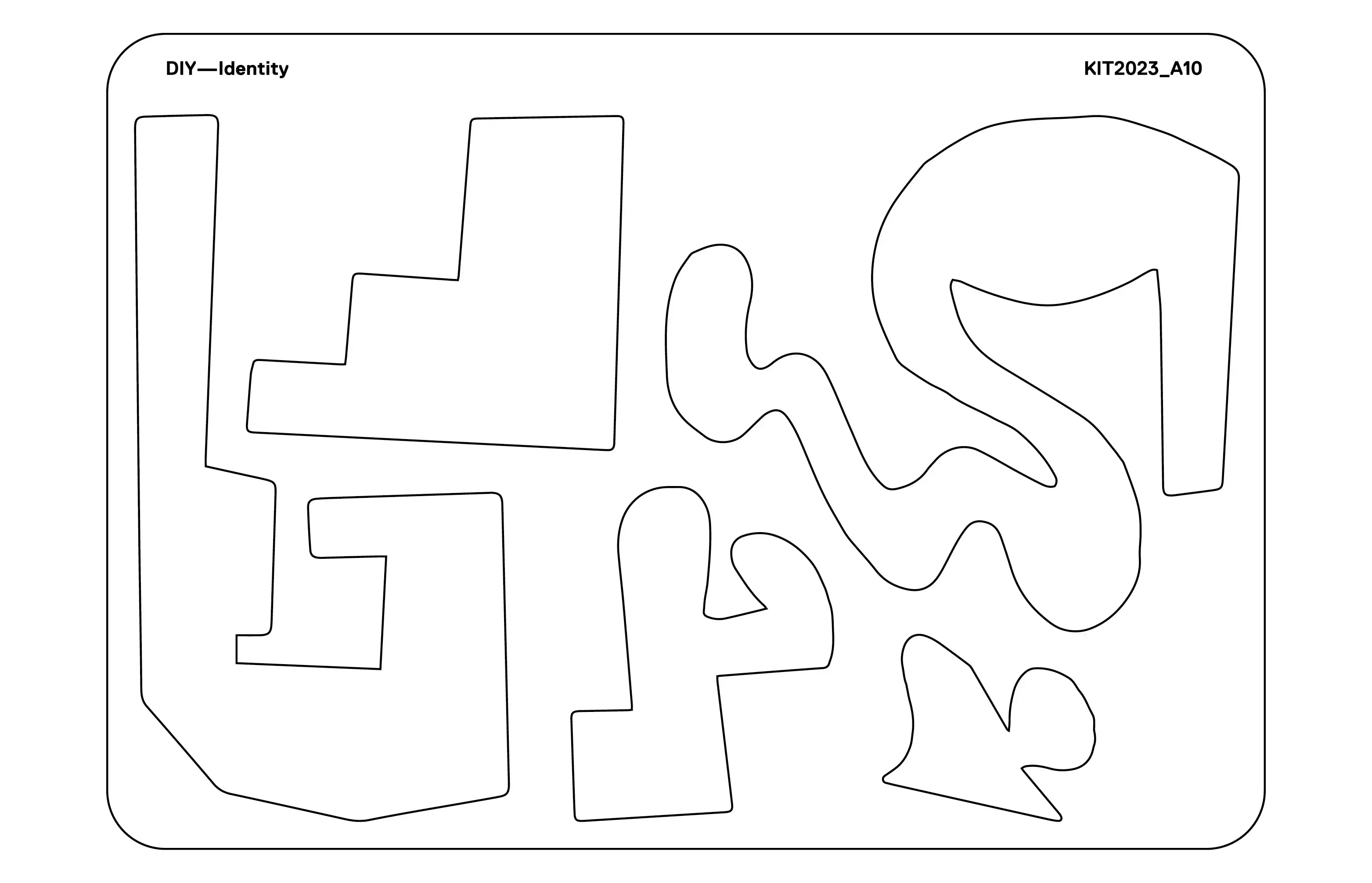
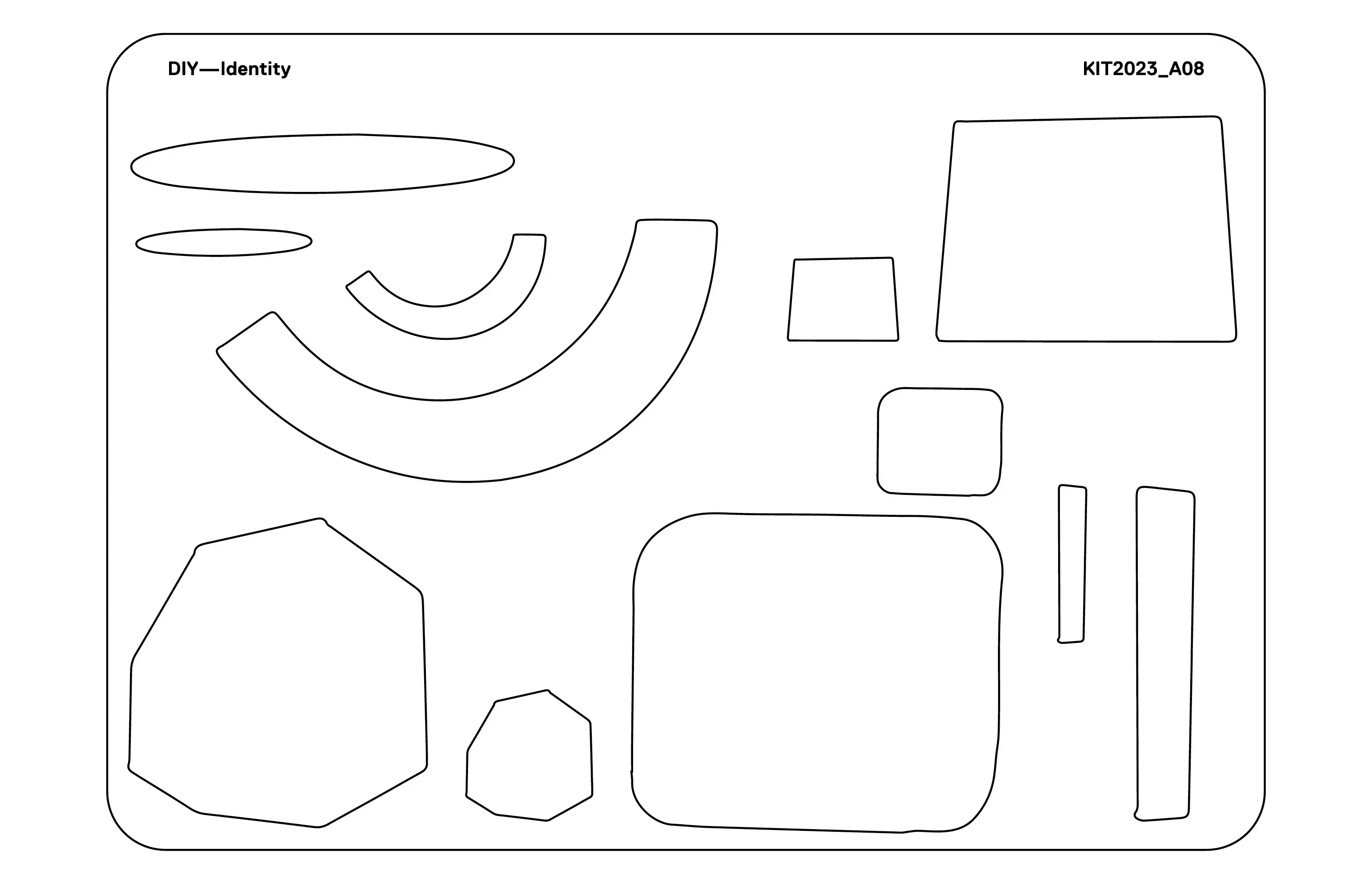
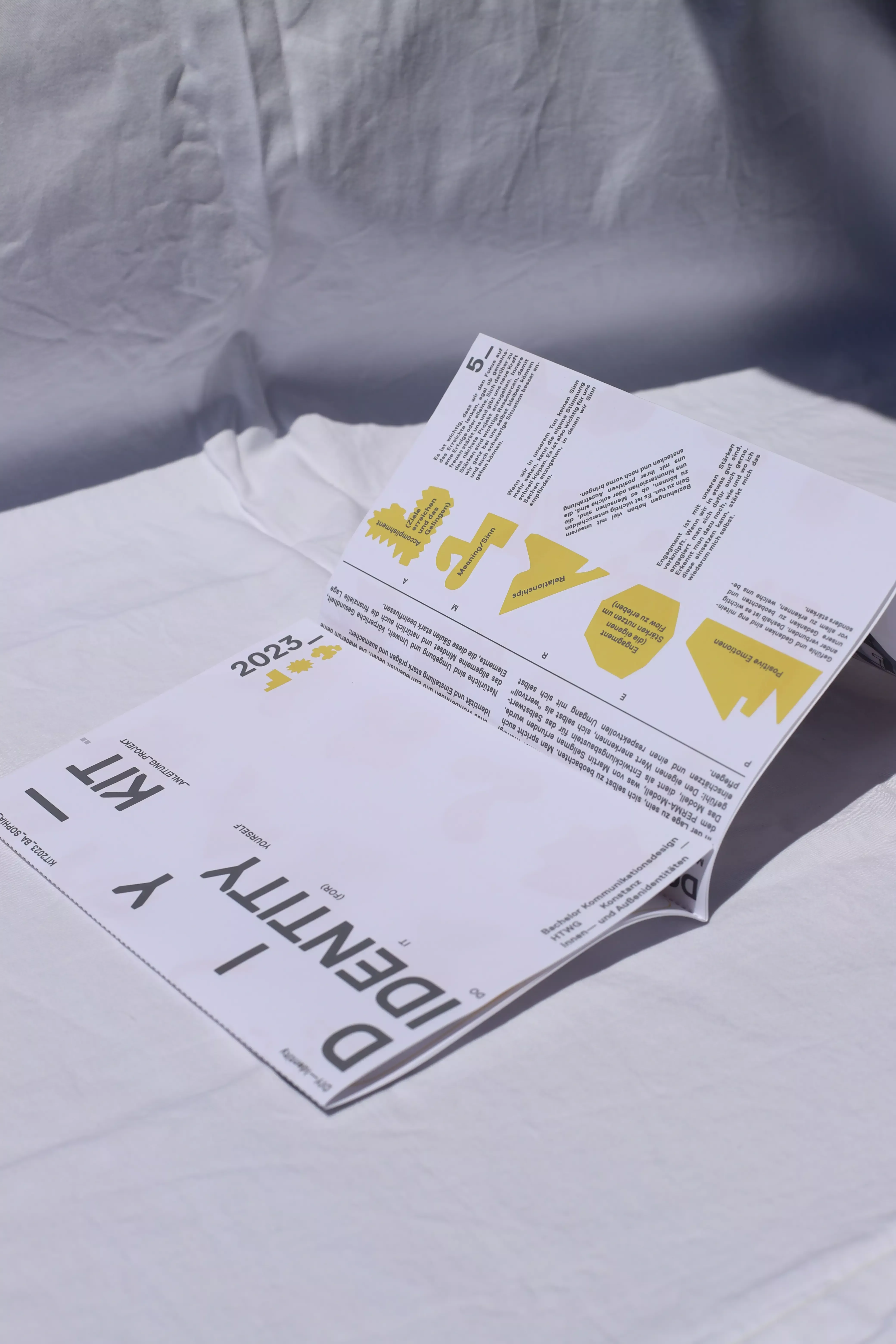
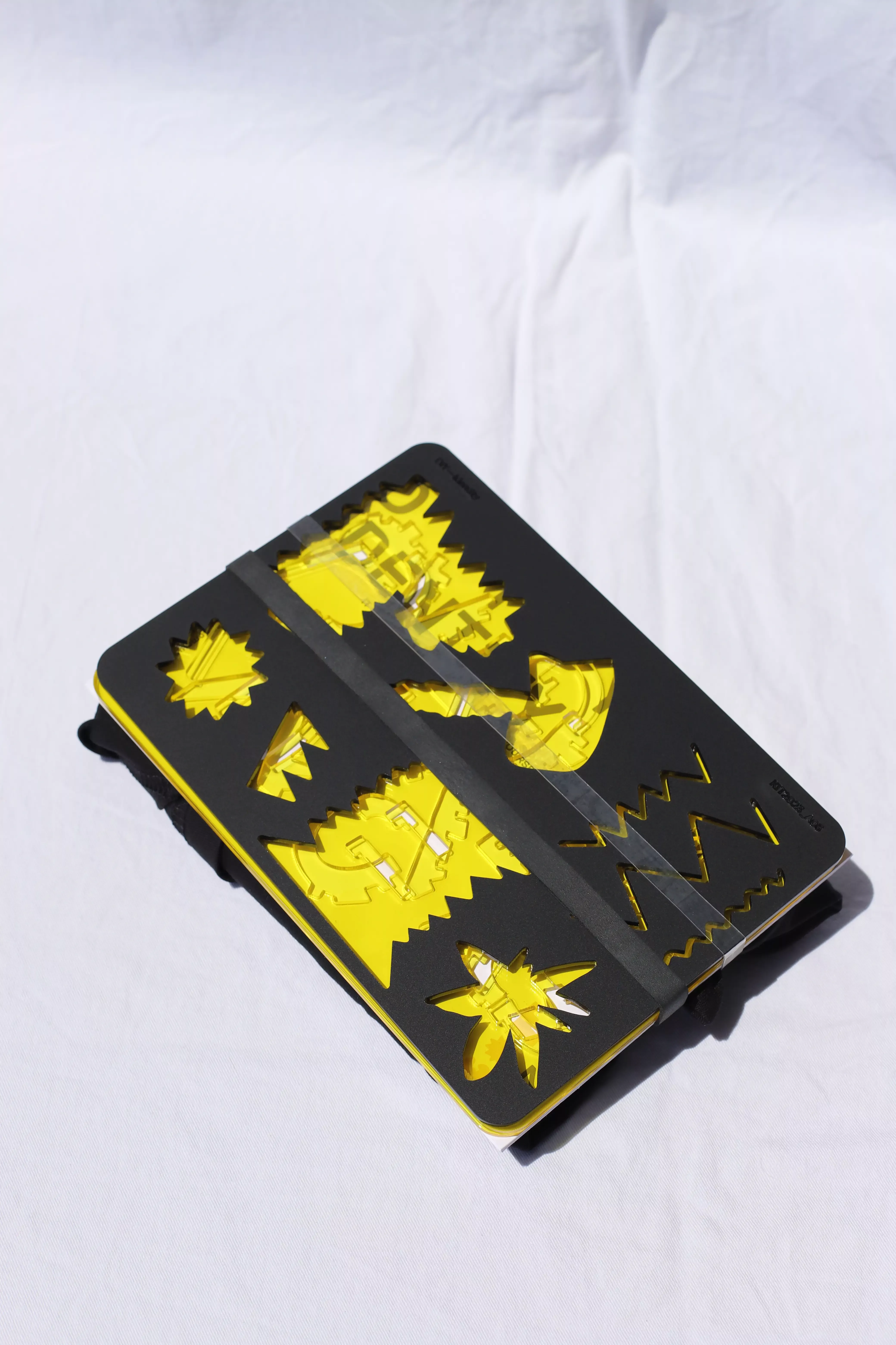
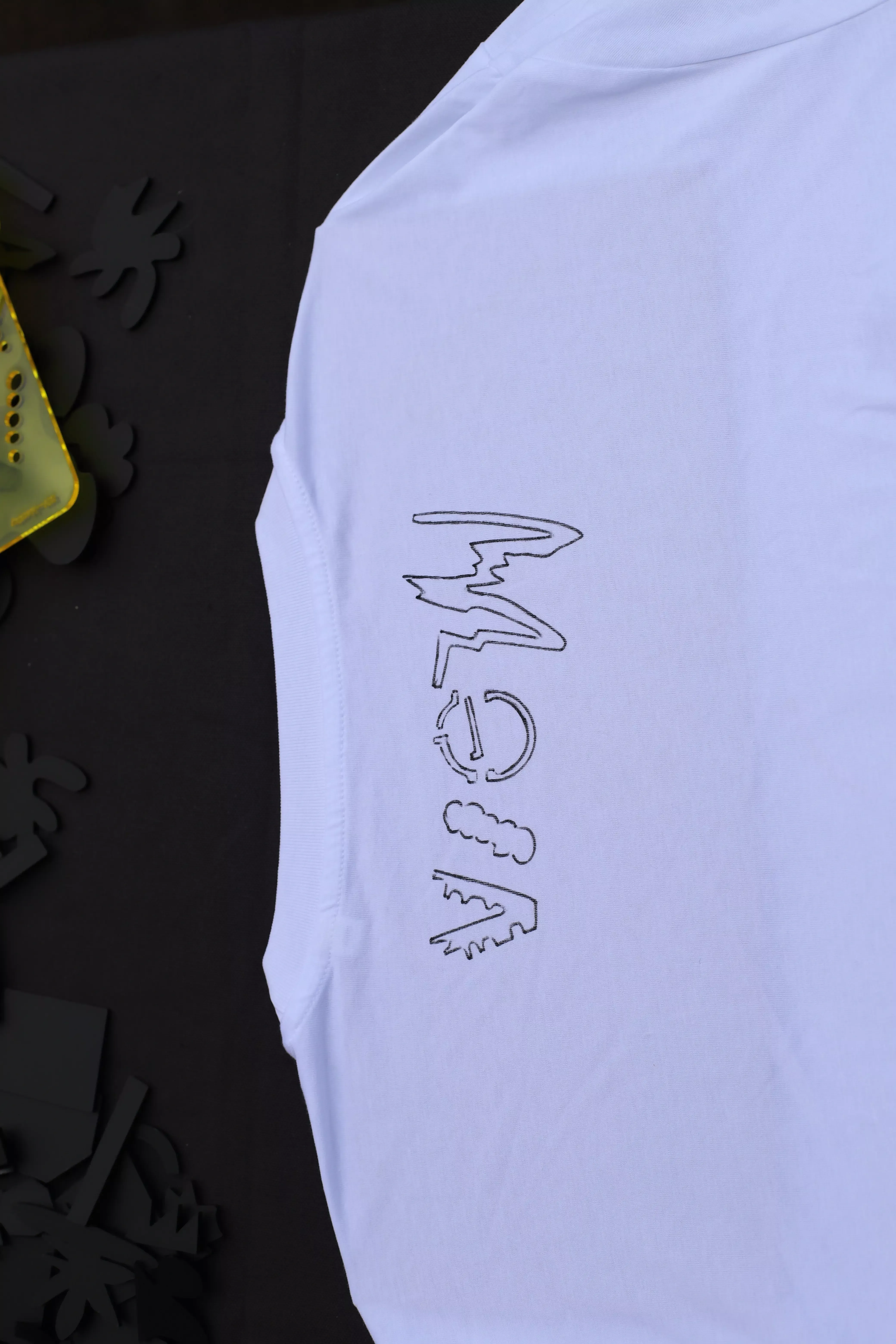
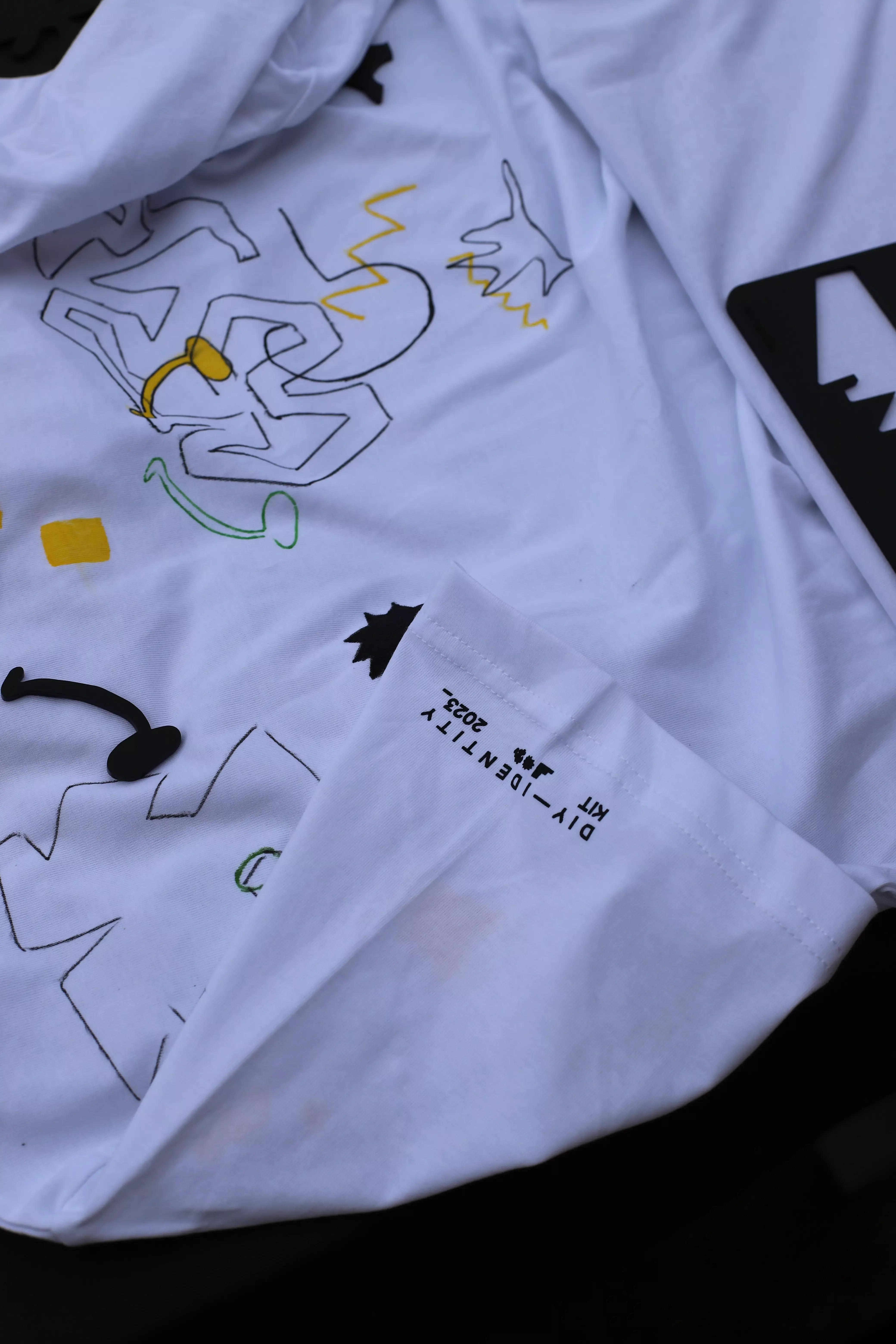
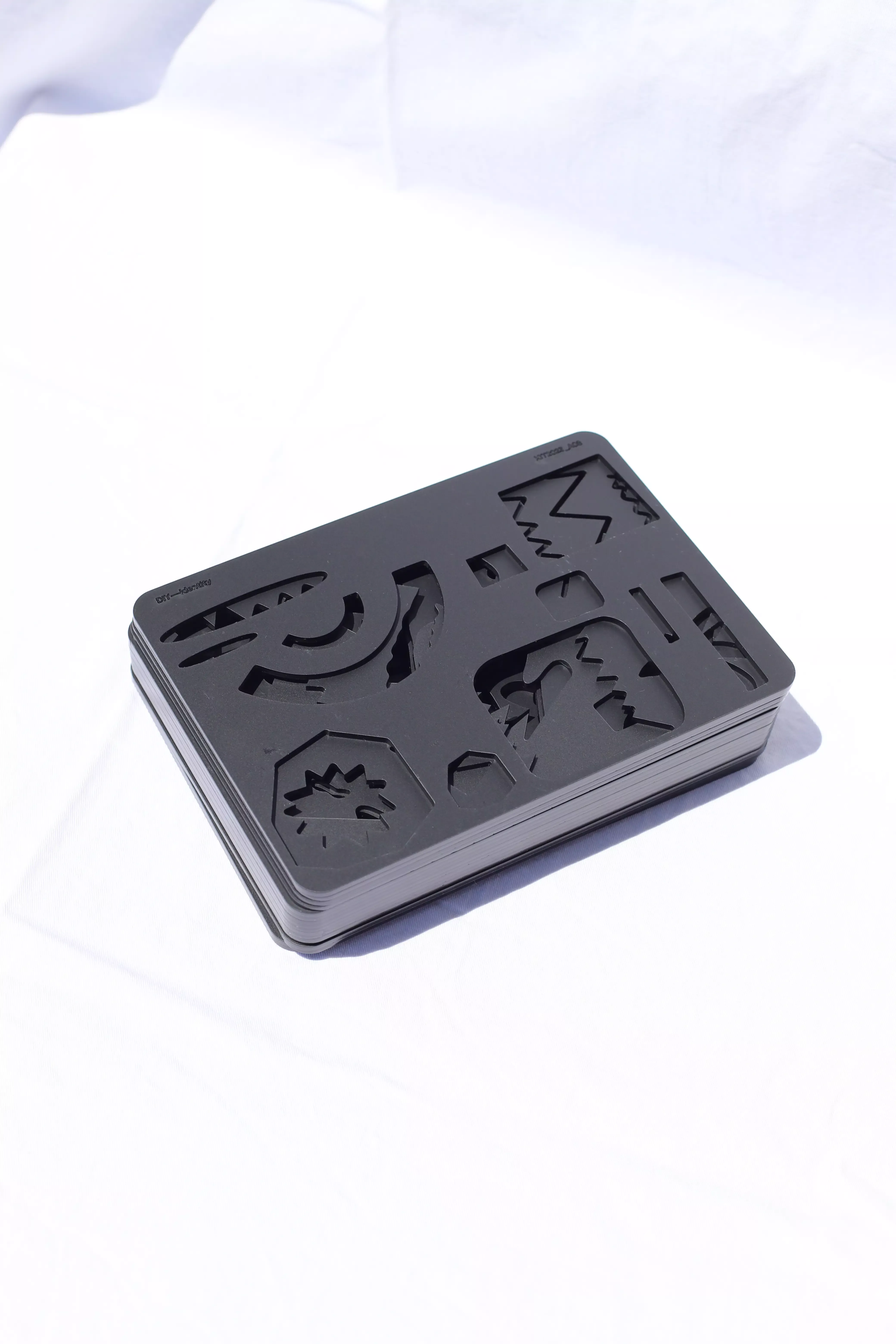
Here, I was allowed to be part of the Slanted 44 with my DIY—Identity Kit. Slanted Magazine #44—Type Fashion a Magazine that explores the intersection of typography and fashion.
Through fashion, we have the option to represent the concept of our own self or our identity, once as we really are, or perhaps, as we would like to be. Therefore, fashion is also an important and "silent" means of communication, because it is through clothing that a person carries this image of himself to the public. First of all, through clothes we address ourselves and then others, therefore it plays a great role in our identity as well as in our relationships with our fellow men. What should not be forgotten is that through this communication there is also a lot of room for deception, fake and sham, and the "authenticity" of one's inner and outer identity can be manipulated.
The DIY-Identity KIT, allows each individual to create his individual design for a fashion piece, which can be flexibly revised and changed. Because identity is changeable and not a constant, it is not fixed to a person and can be changed, like a point of view. The KIT creates possibilities and simplifications to bring one's inner self flexibly to the outside and to design it oneself. Through different stencils to color, a leaflet in which you can define your own stencil and apply it to textile or a surface of your choice, everyone is given the opportunity to live out their own identity freely and show what you feel like. Because with fashion that we buy, one is prescribed what is currently "hip". This fashion is produced under a certain theme and sold several times. One lives out, so to speak, the identity of the brand or the fashion designer and not necessarily their own, individual authenticity.
This project also made it into the Slanted Magazine #44-Type Fashion Autumn/Winter 24/25.
Click here for the magazine
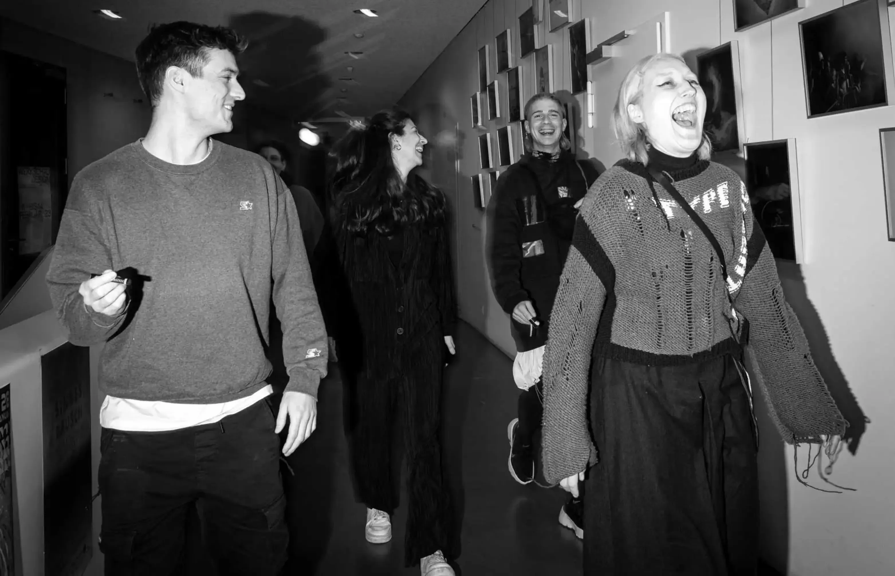
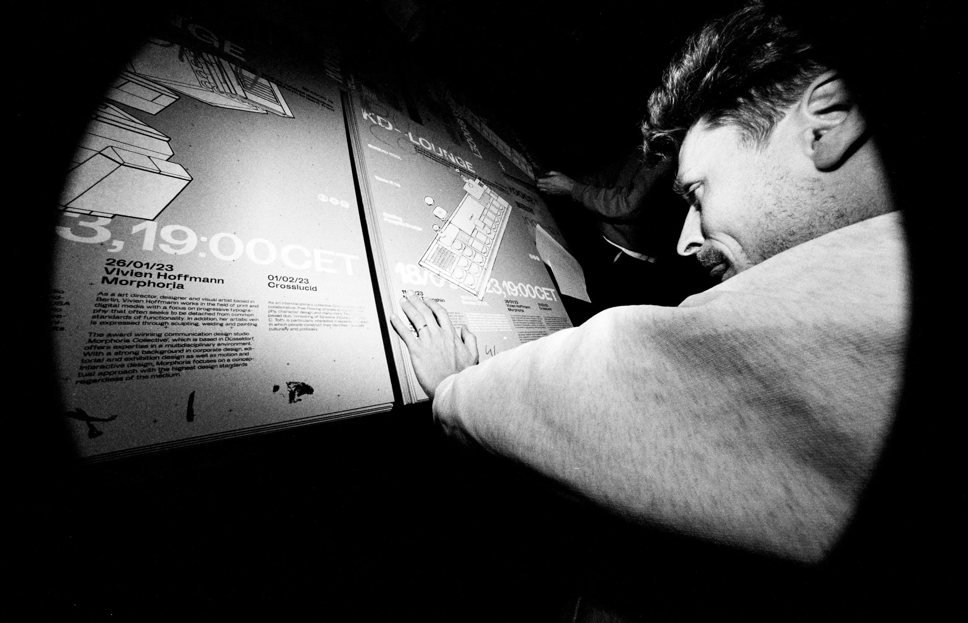
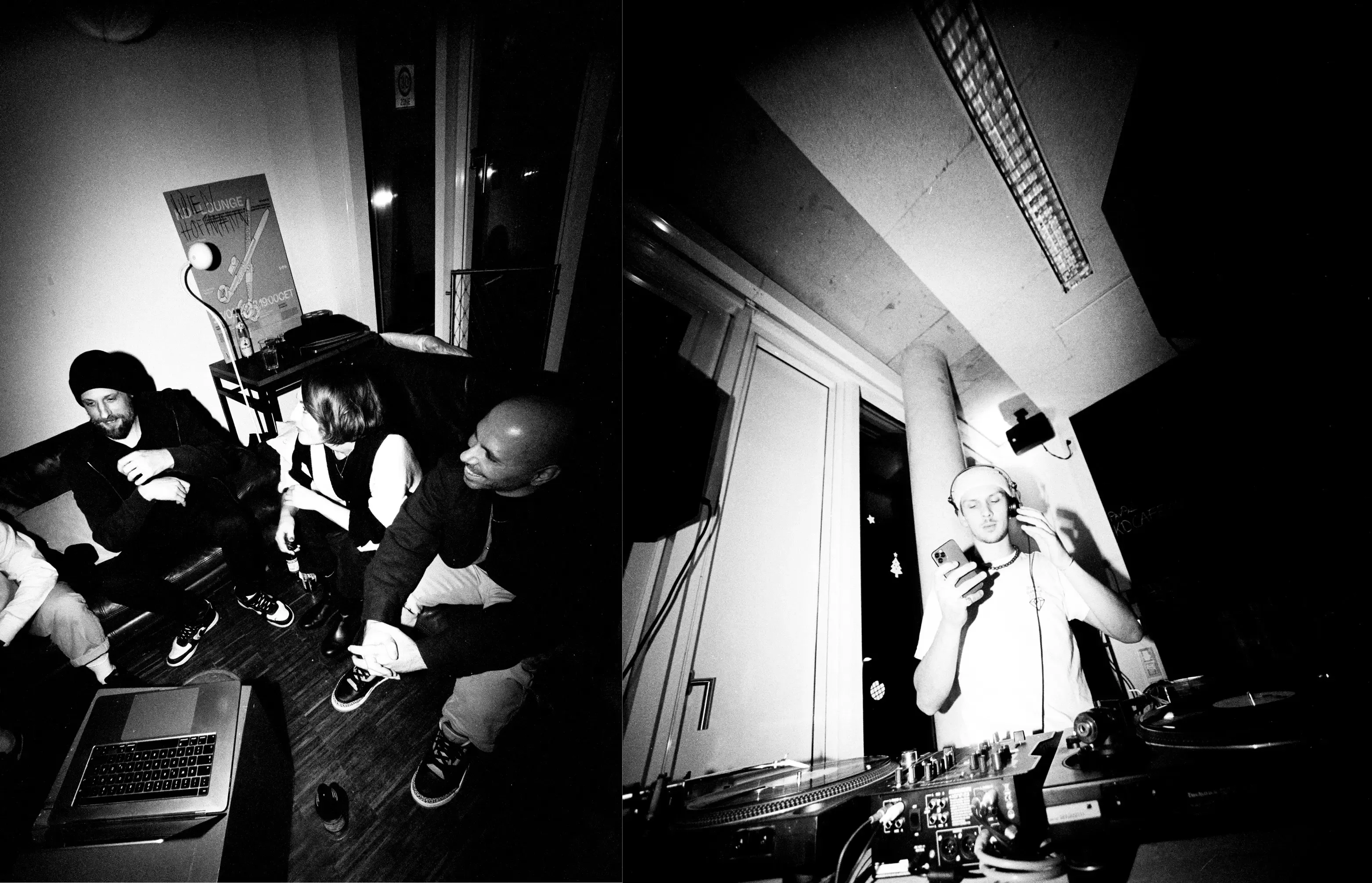
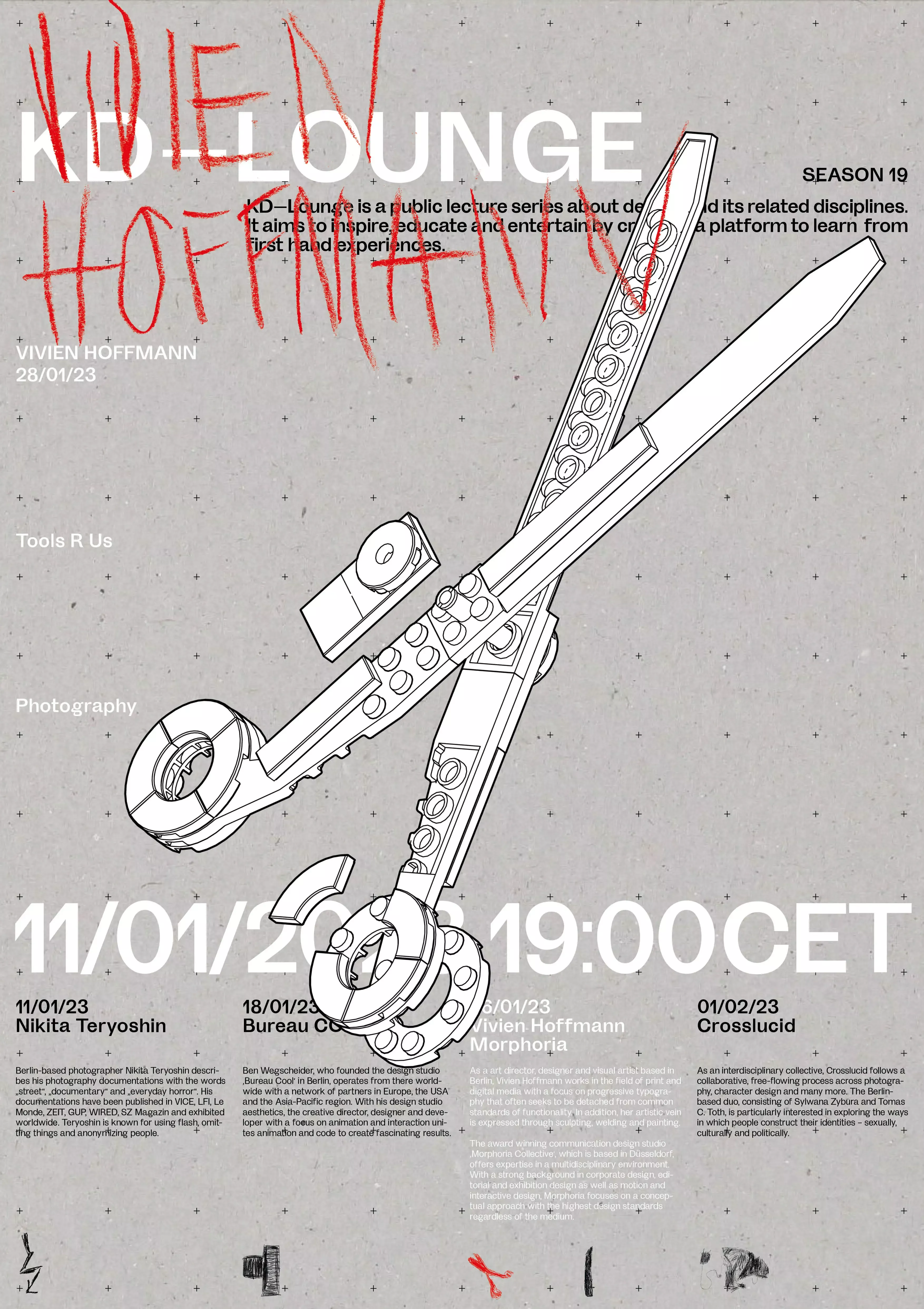
KD—Lounge is a public lecture series organized by students of the HTWG University of Applied Sciences in Constance, featuring renowned designers, studios, and agencies to inspire young designers. Organized by students on a non-profit basis, funding comes from merchandise sales and local sponsors. We created a concept, branding and promotional materials as well as 3D animations and animated posters for each lecture. This Season (19) the lounge works under the theme "Tool R Us", we focused on the tools that make the work of our speakers special and staged them as key visuals. In collaboration with Luis Hofstetter, Alex Waste and Lisa Sonntag, we create the whole design and concept for these season.
"Tools R Us" is dedicated to the interplay between hobby and job, play and discipline, profitability and experiment. We ask our guests (Nikita Teryoshin, Bureau cool, Morphoria collective, Vivien Hoffmann and Crosslucid) to tell us more about how they habe involved towards their current design, what role fun and experiment still play in their daily disciplines and what tools they use.
Our project received silver and bronze nails, as well as an award from the Art Directors Club Germany.
I participated in the Poster Can Help issue from Slanted, which published in February 2023. With a global call, they invited the design community to contribute with a piece of work and a donation. 434 people from all over the world participated in this project and almost 700 posters were submitted, which resulted in a colorful potpourri of posters, each one a compassionate outreach and act of charity—literally. All the proceeds gained through the submissions have been donated to two selected organizations that we appreciate for their work: ARTHELPS and MSF—Médecins Sans Frontières. Any profits beyond covering the costs of printing the book will also be donated to those organizations.
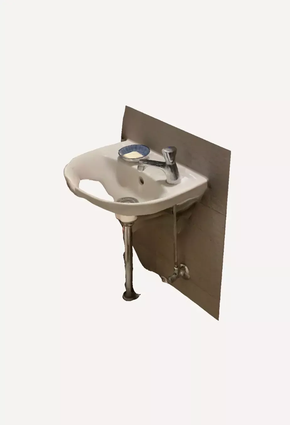
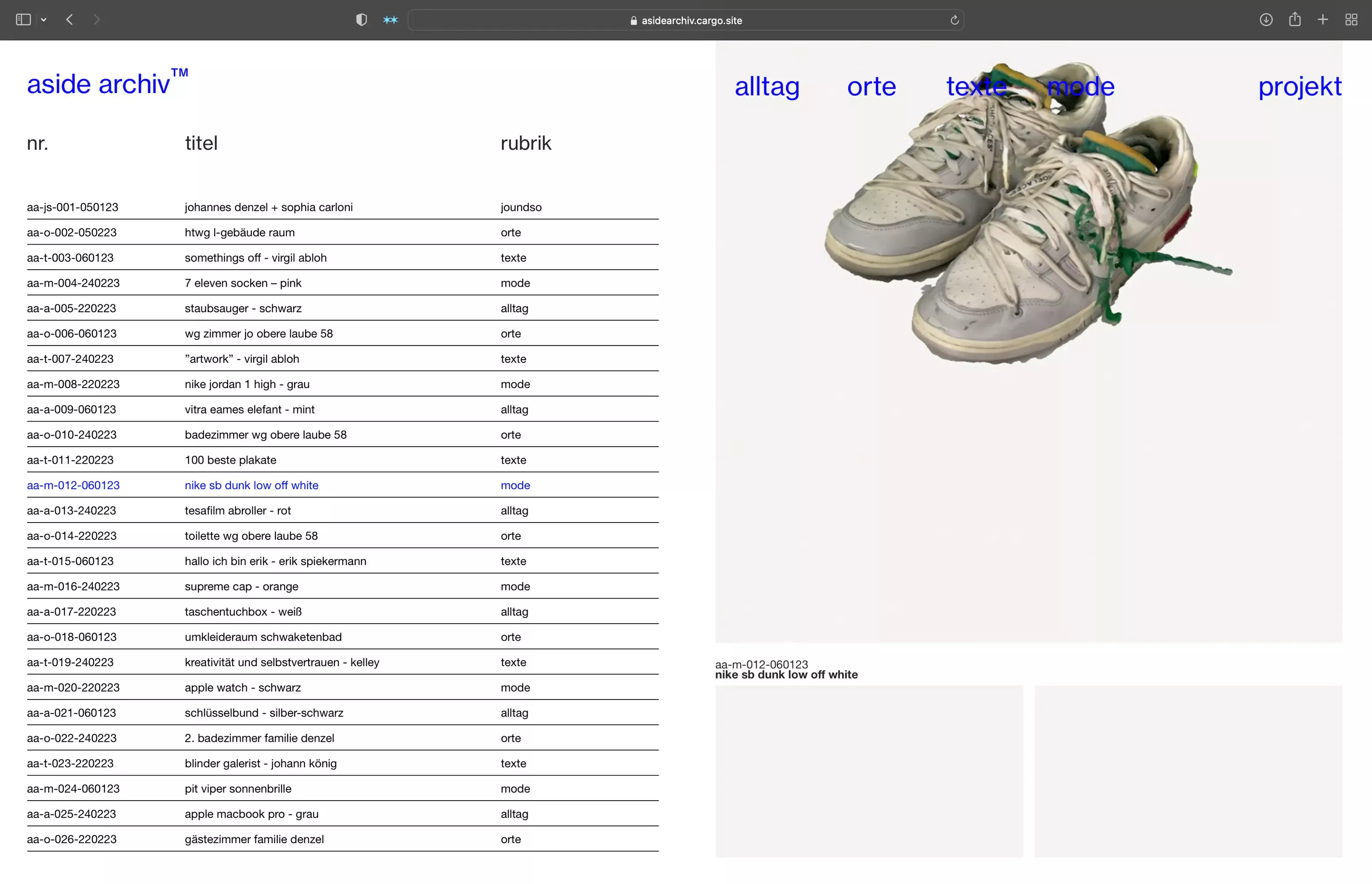
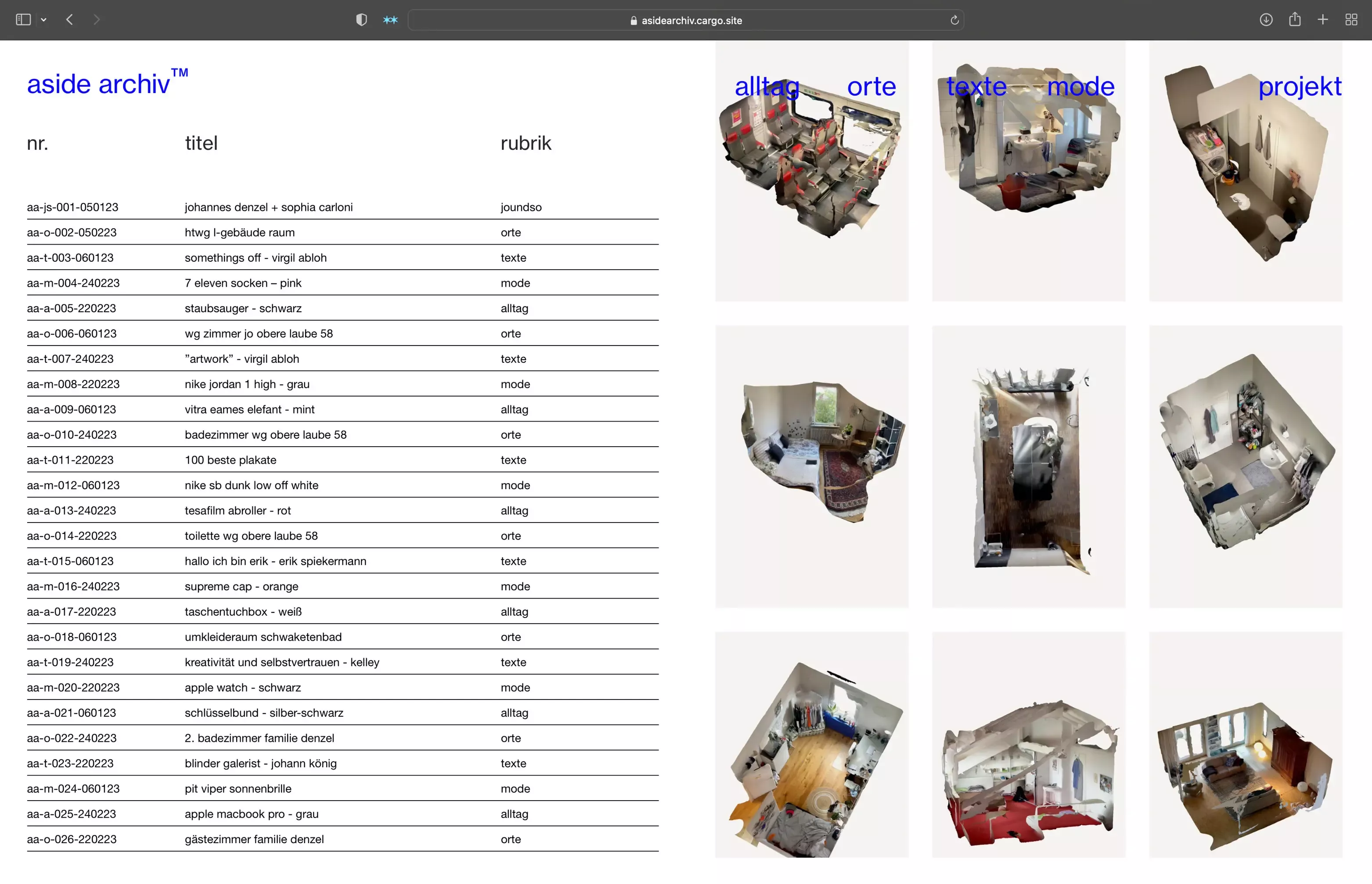
aside archive-all that is, all that goes, all that hands.
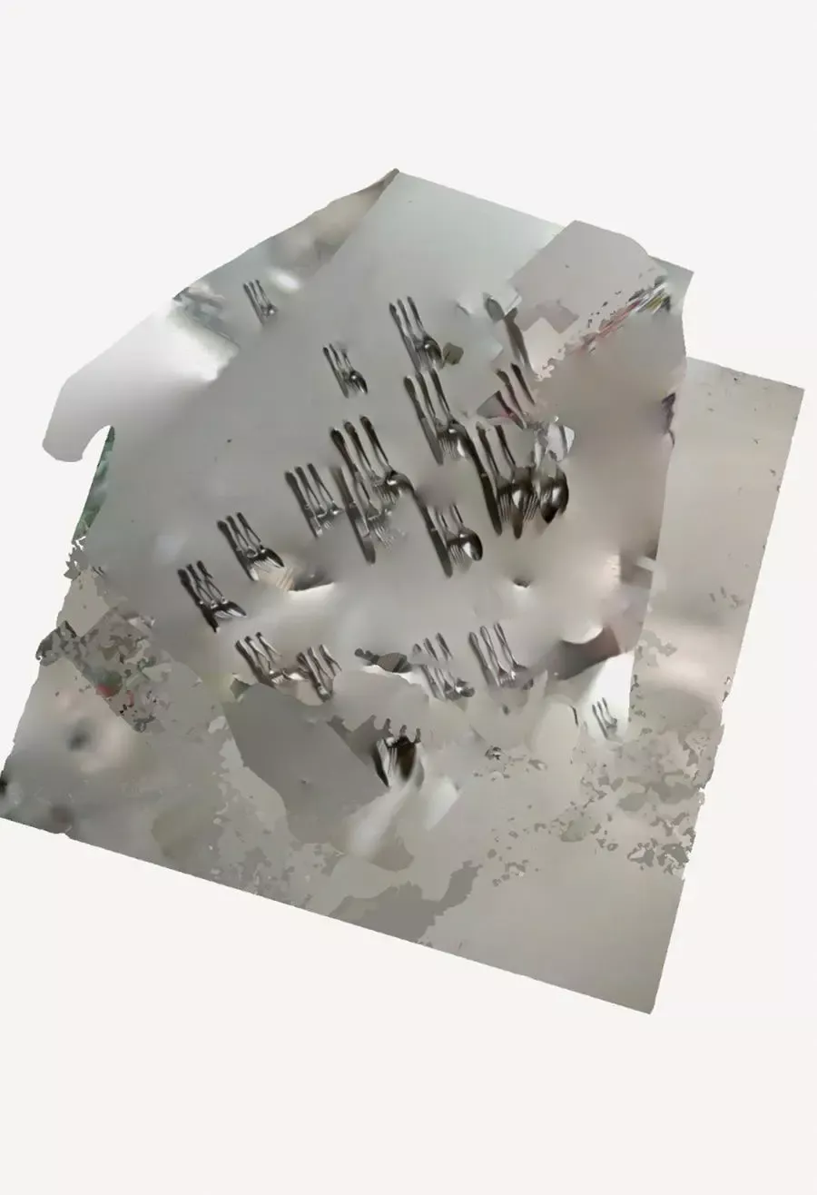
An archive based on 3d recordings, which can be found in different categories.
A project in collaboration with Johannes Denzel. You produce a lot of recordings over time, you create a lot of objects and items, but you quickly lose track of them. in the process, certain moments, emotions, memories and experiences get lost or they move into the background or disappear. aside archive, a place where you can put them aside. Through structure and systematics, a place of archiving and storing produced data is created. Through visual insights, naming and time overviews, you can quickly find the desired content.
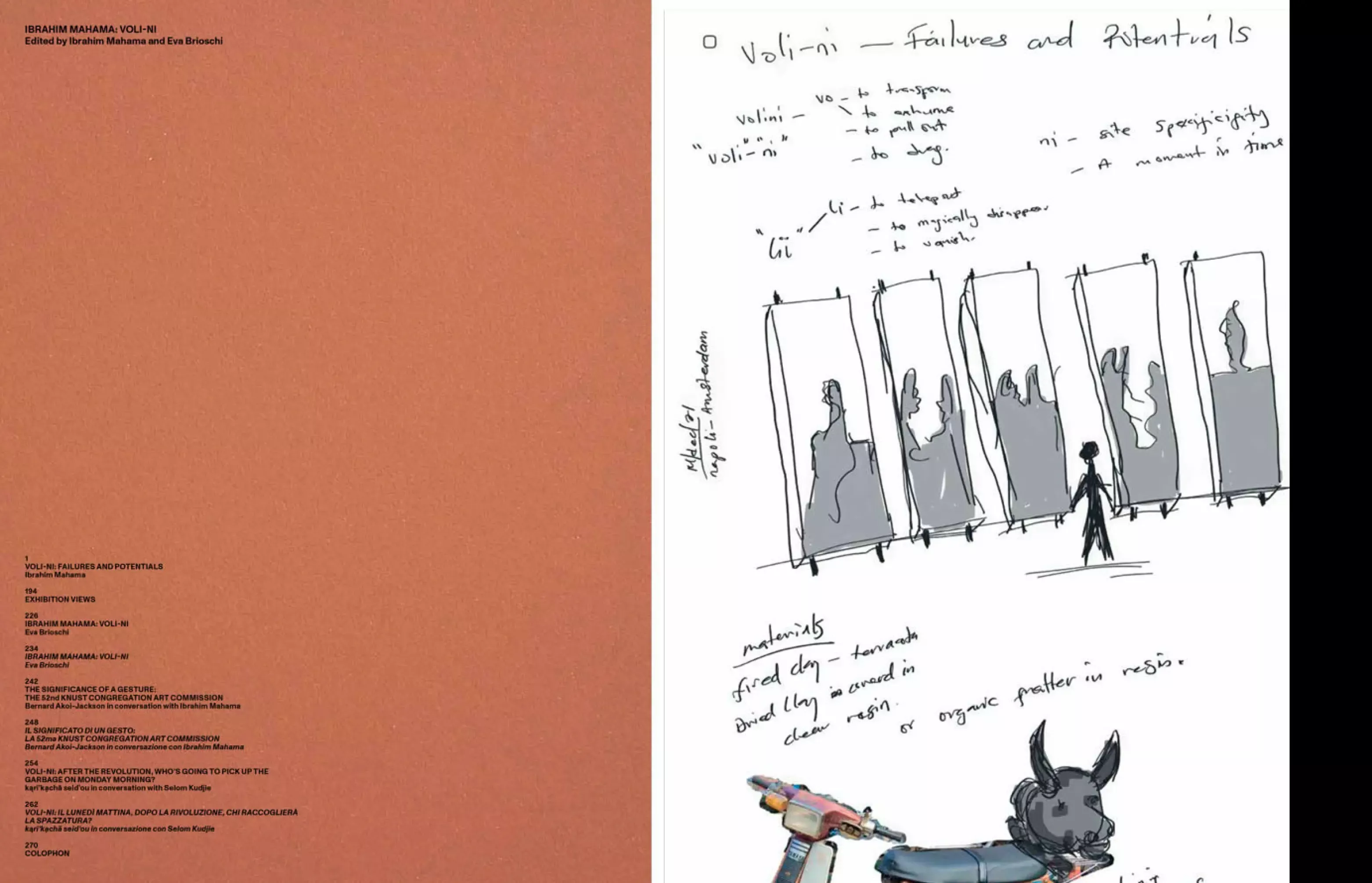
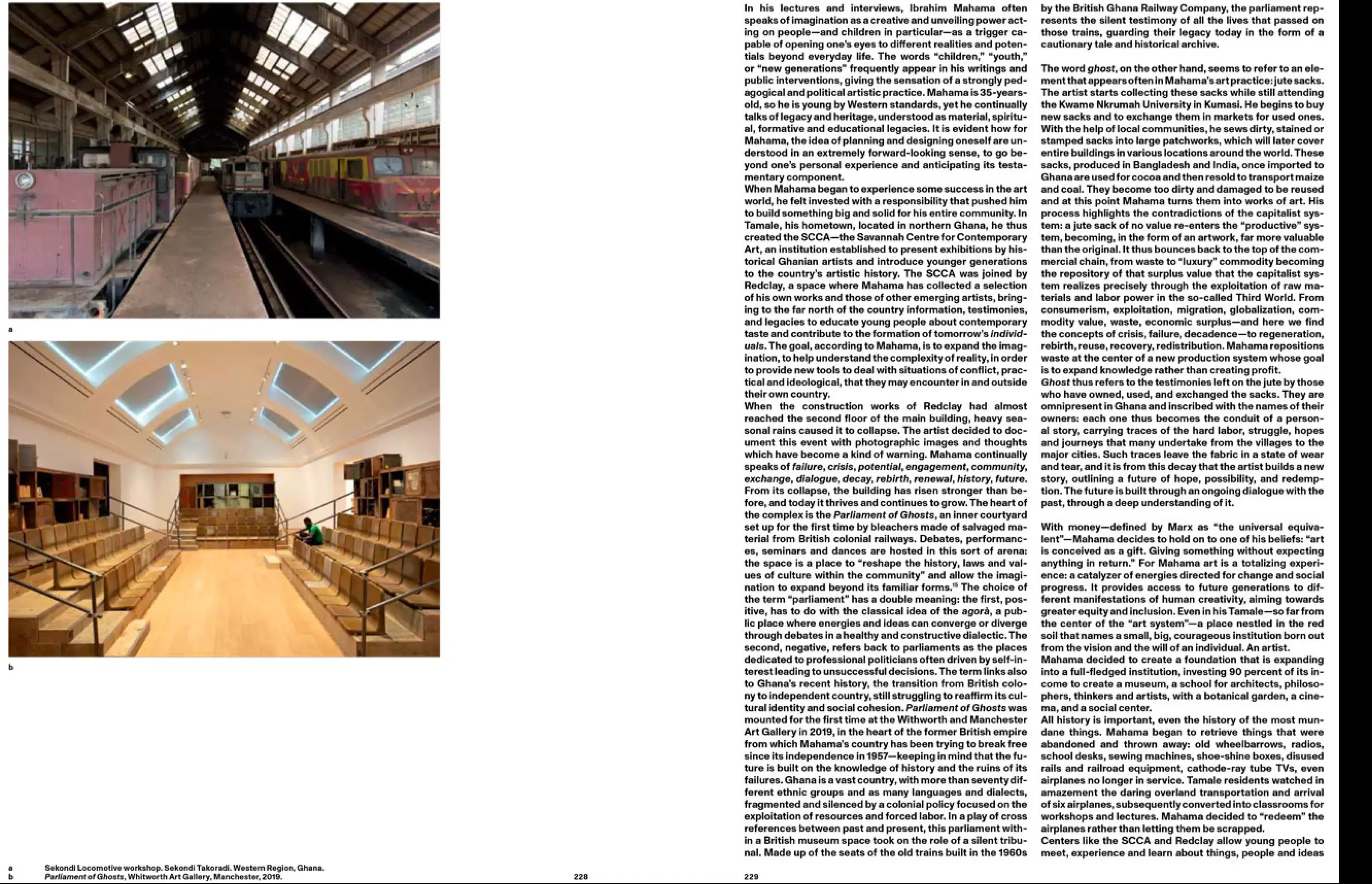
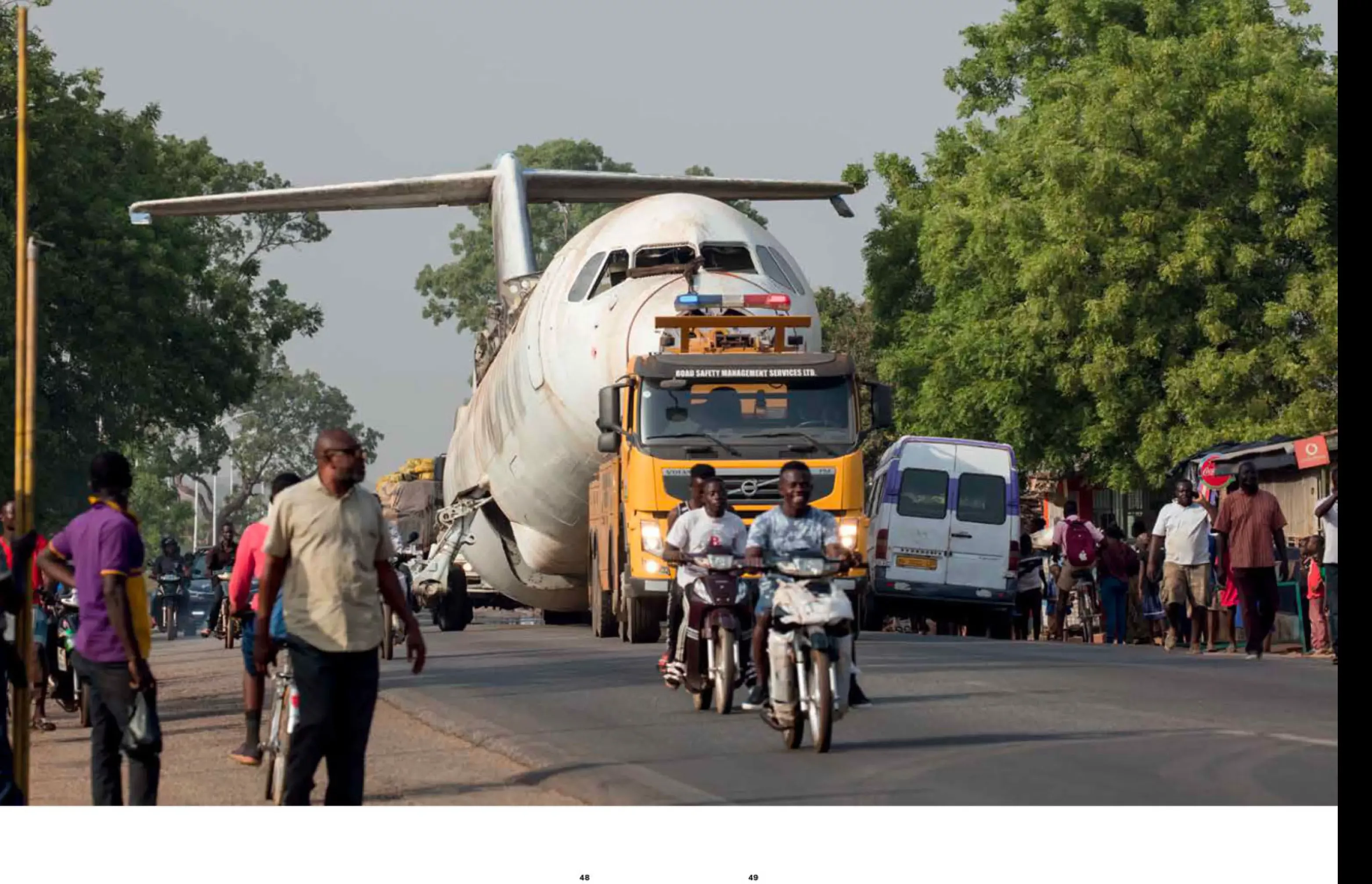
The Layout design and book concept for Voli-ni, a visual diary book of the artist Ibrahim Mahama for Studio Temp.
The book contains 272 pages and is written in English and Italian. Published on the occasion of Mahama's inaugural exhibition at the Eataly Art House in Verona, this volume is conceived as a visual diary of the artist's impressive work in his hometown of Tamale, a community-based project based on the understanding of art as a totalizing, reparative experience: a catalyst of energies directed towards change and social progress. The exhibition includes texts by curator Eva Brioschi, by Mahama's professor and mentor karî'kachä seid'ou with Selom Kudjie, and by Mahama himself with Bernard Akoi-Jackson.
Voli-ni, which literally means "inside the hole," is composed of separate particles, each with its own meaning: Vo, "to draw out," "to extract"; li, "to transfer," "to teleport"; and ni, "here and now."
Voli-ni thus means an emergence from darkness, from a failed past of defeat, toward the possibility of redemption, regeneration, through a real (restored architecture) or imaginary (art) portal.
- Print, Web, Fashion
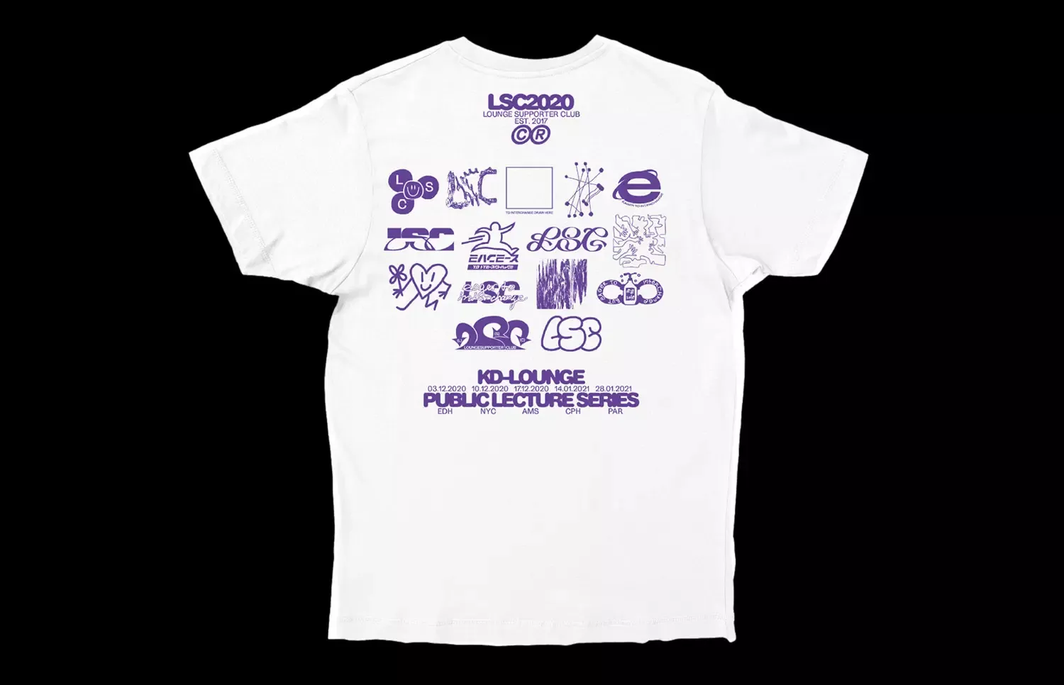
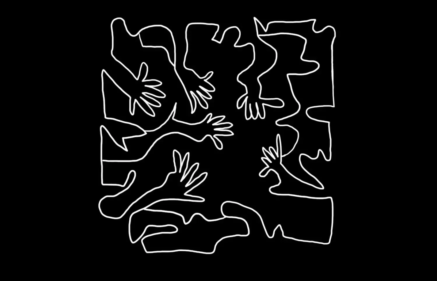
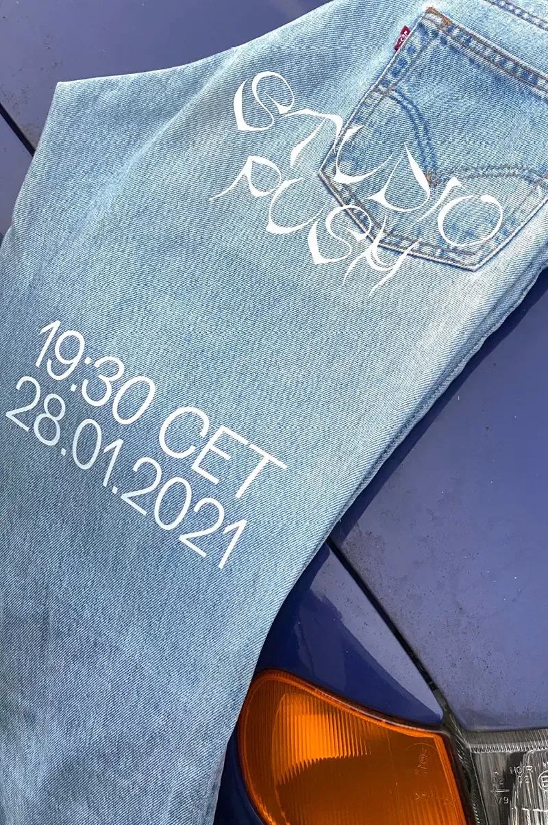
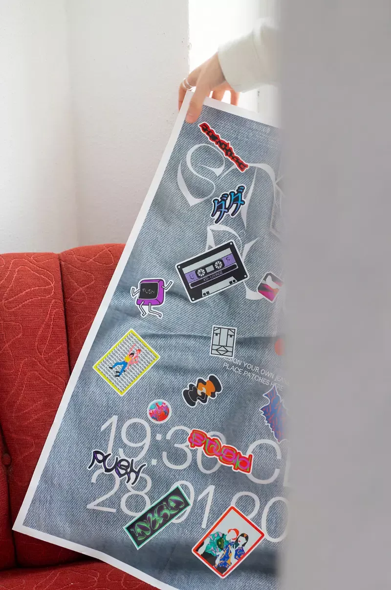
KD—Lounge is a lecture series organized by students of the HTWG University of Applied Sciences, Constance. Under the theme "Eager to Interchange" I designed a logo for the LSC (Lounge Supporter Club) release. In collaboration with other team members we also created a trailer for the Lounge Season 15. For the specific lecture by Studio Push from Paris, which is part of the KD—Lounge lectures, Antonia Viola, Charis Fischer, and I designed a poster and animation.
- Print, Experiment
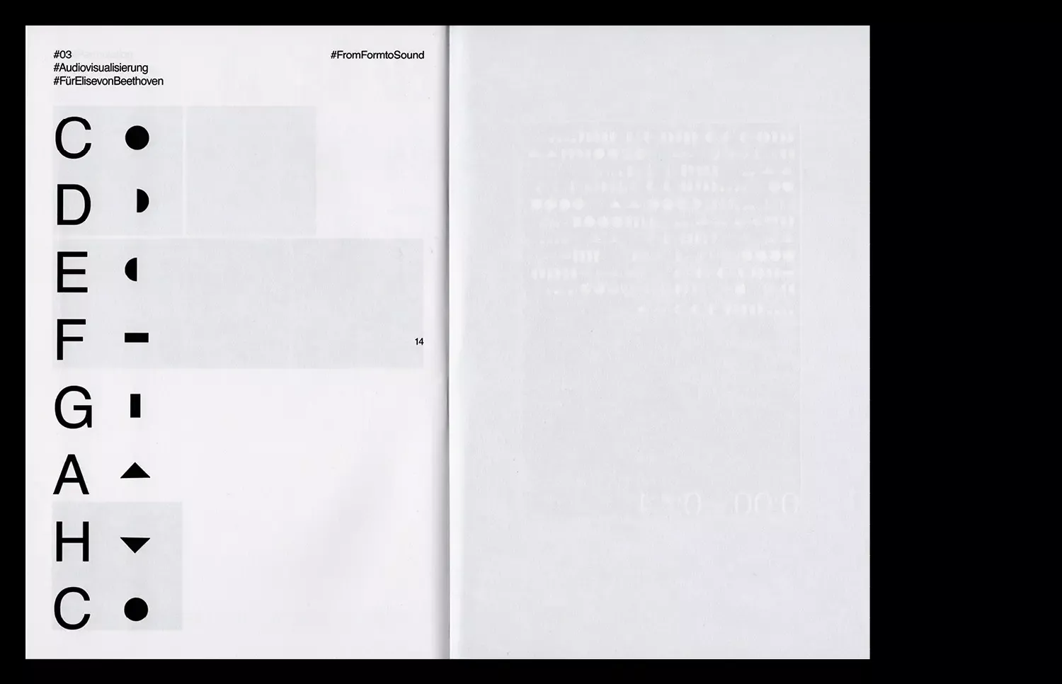
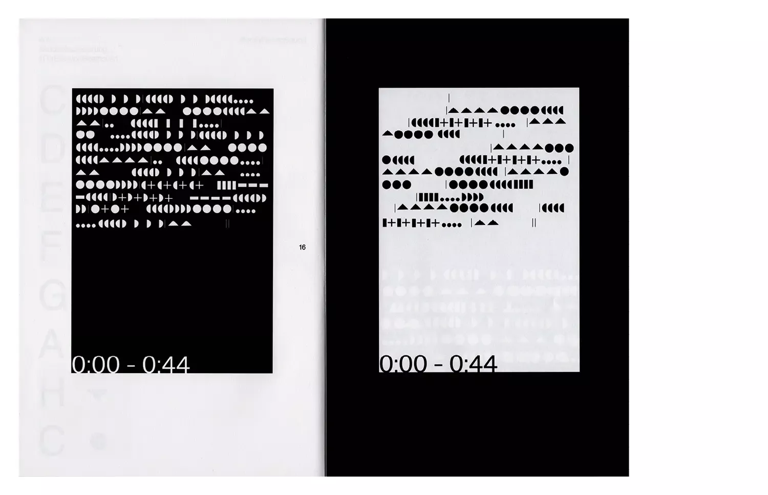
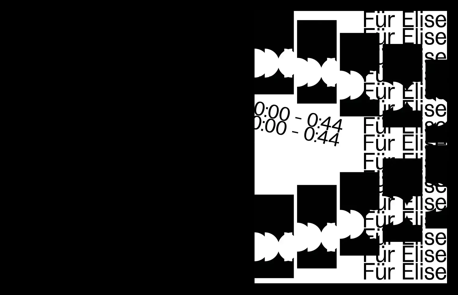
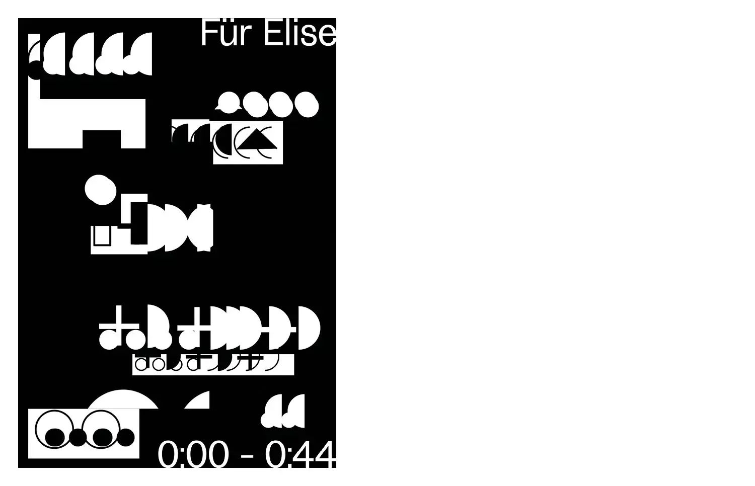
The piece of music "für Elise" by Beethoven was visualized and translated into shapes that were assigned and defined to each musical note.
- Print, Web
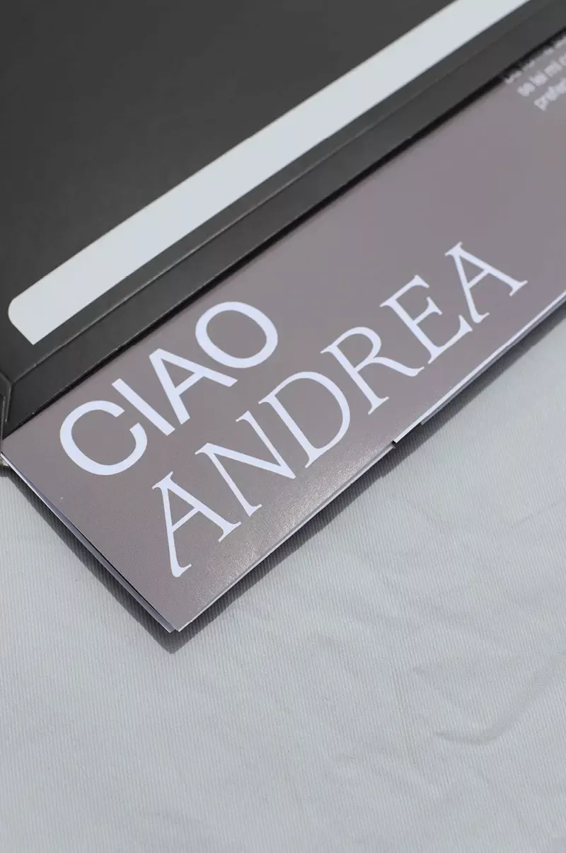
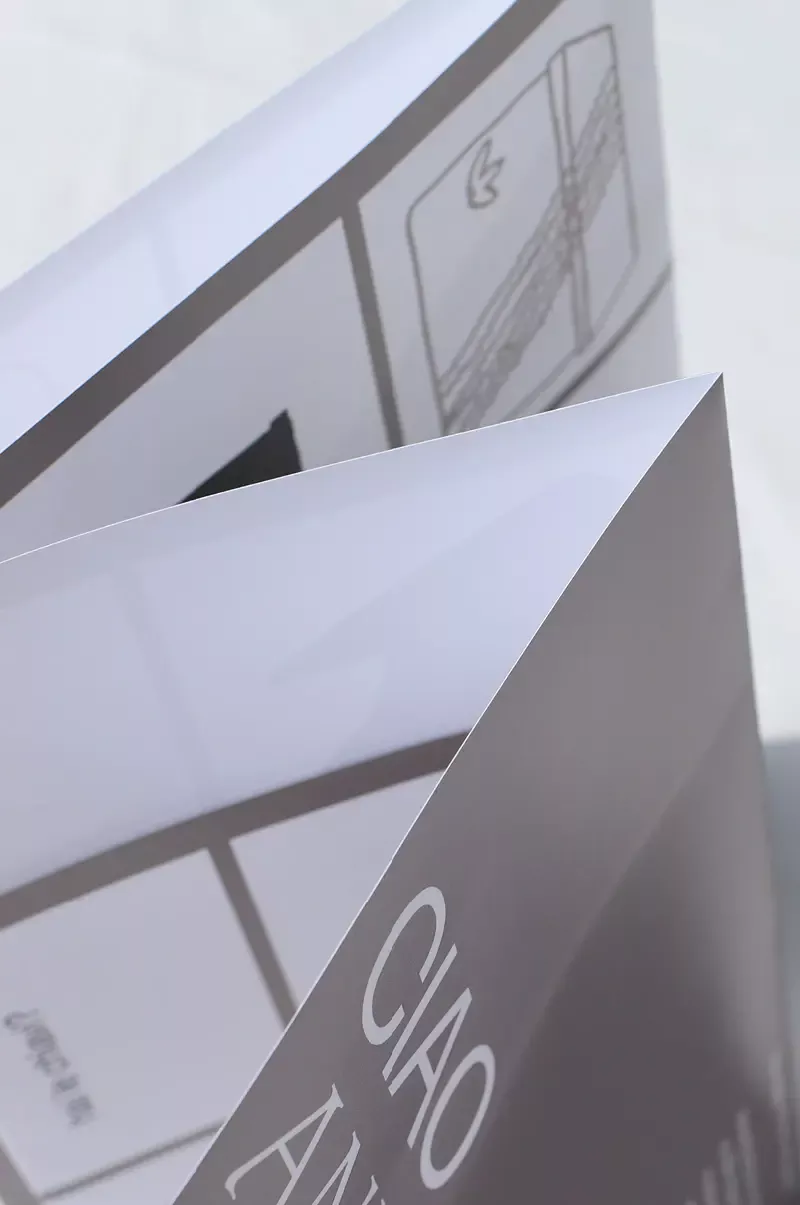
For the Italian architect and designer Andrea Branzi, I created this poster game. From the existing forms of his designs, I have associated and created new shapes. Through the overlay of his and my forms a game results. This poster was sent to Studio Branzi in Milan as a cover letter for an interview.
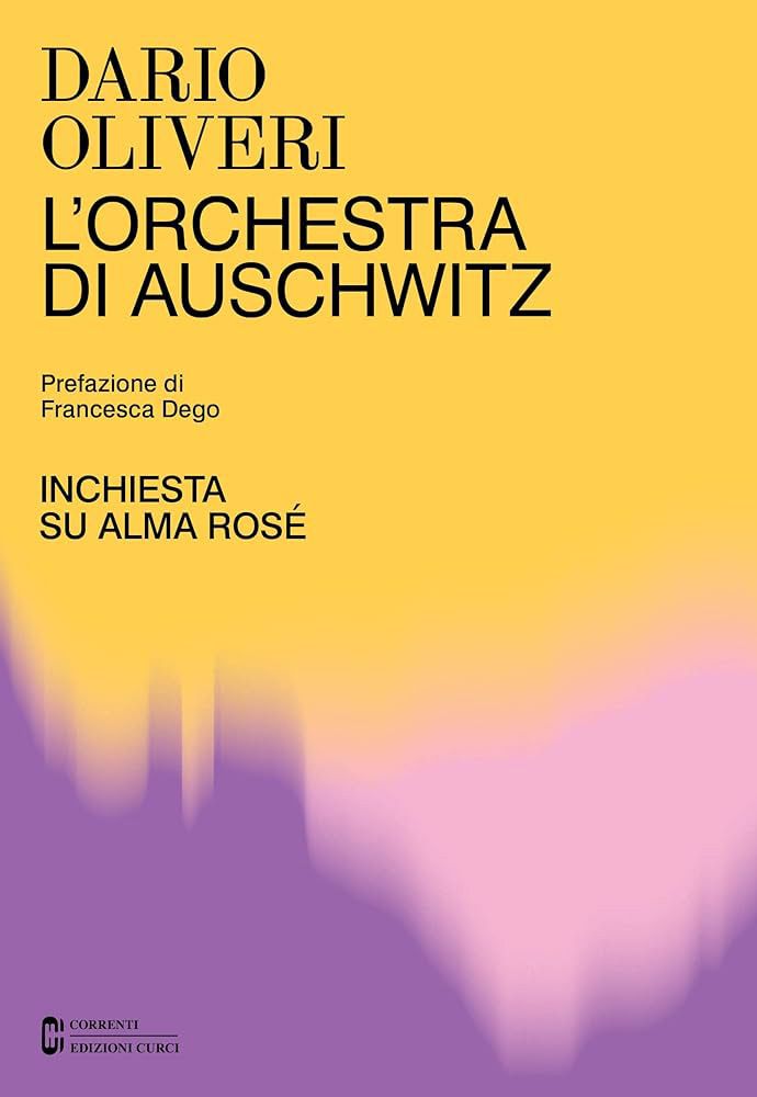
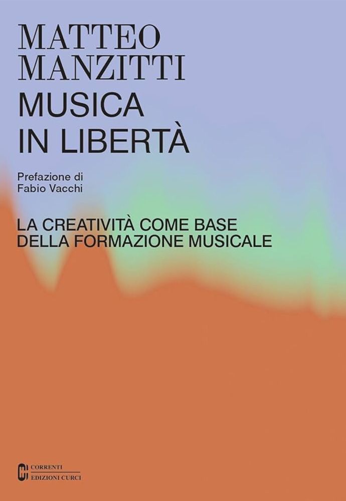
Cover design for book editions with gradient and color composition for Edizioni Curci for Studio Temp.
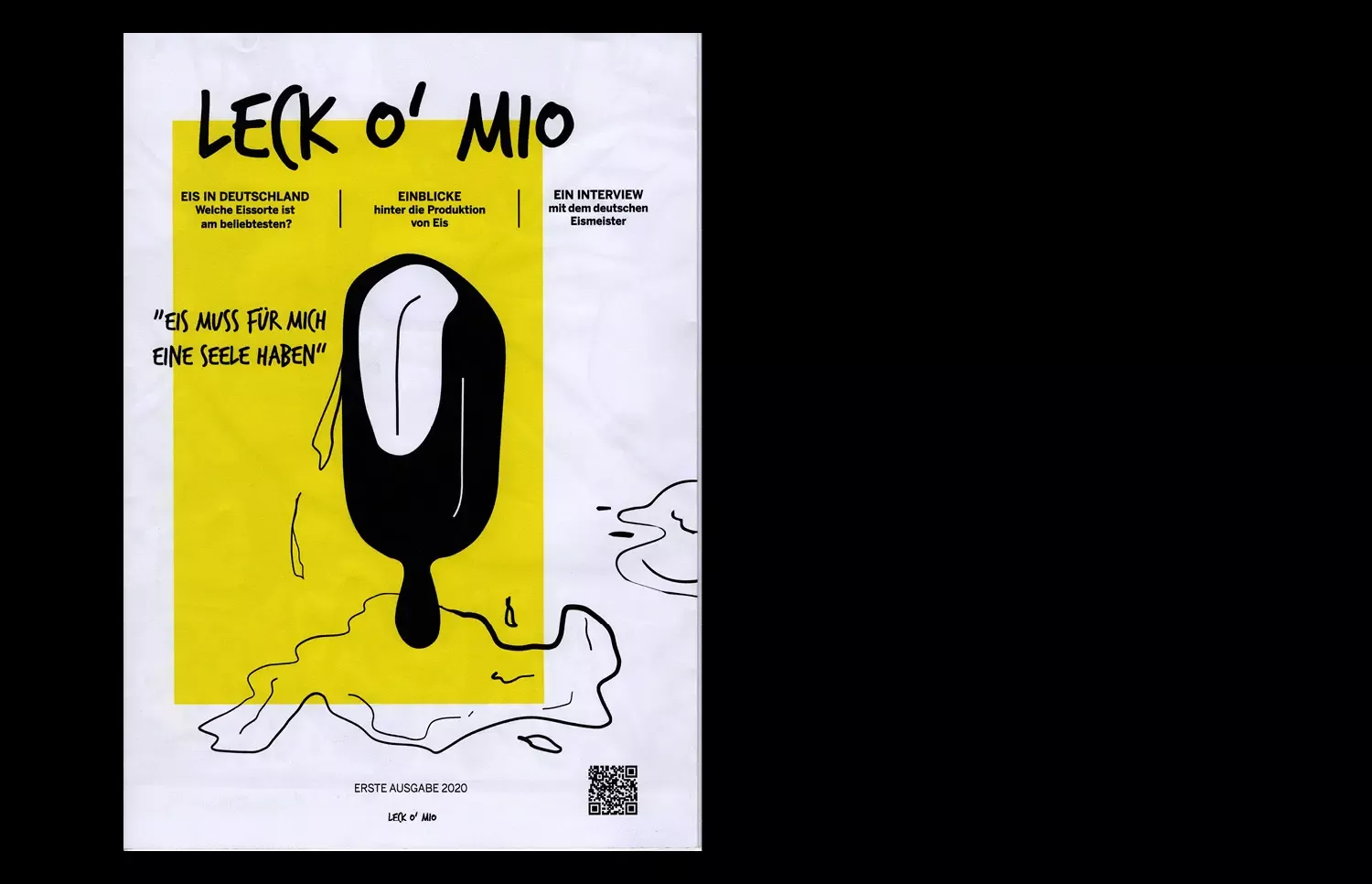
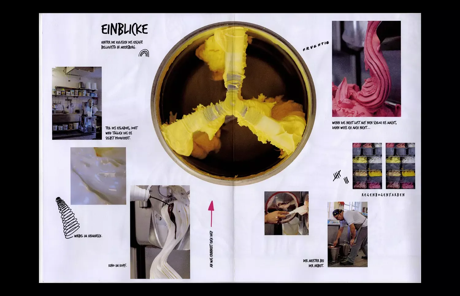
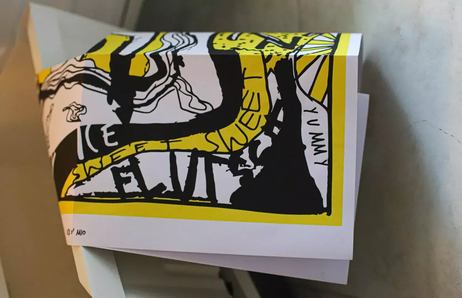
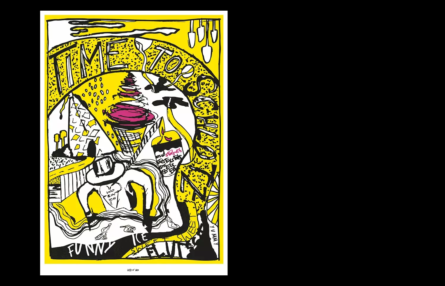
Ice cream, my everyday hero. This biannual issued, folded magazine was inspired by my father, whom I consider to be the best ice cream artist in Germany. Leck o`mio brings ice cream culture to you in a new way. After reading the latest trends, you can unfold the magazine to reveal an A1-sized, collectible wall poster. The magazine is full of ice cream related illustrations, colors from the CMYK system, as well as interesting behind the scenes photographs, and interviews that make this publication unique and appealing.
- Print, Web
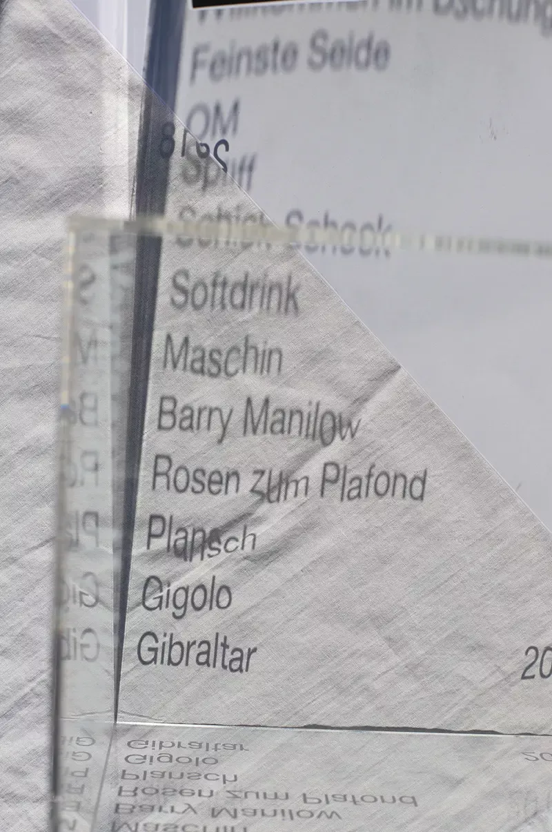
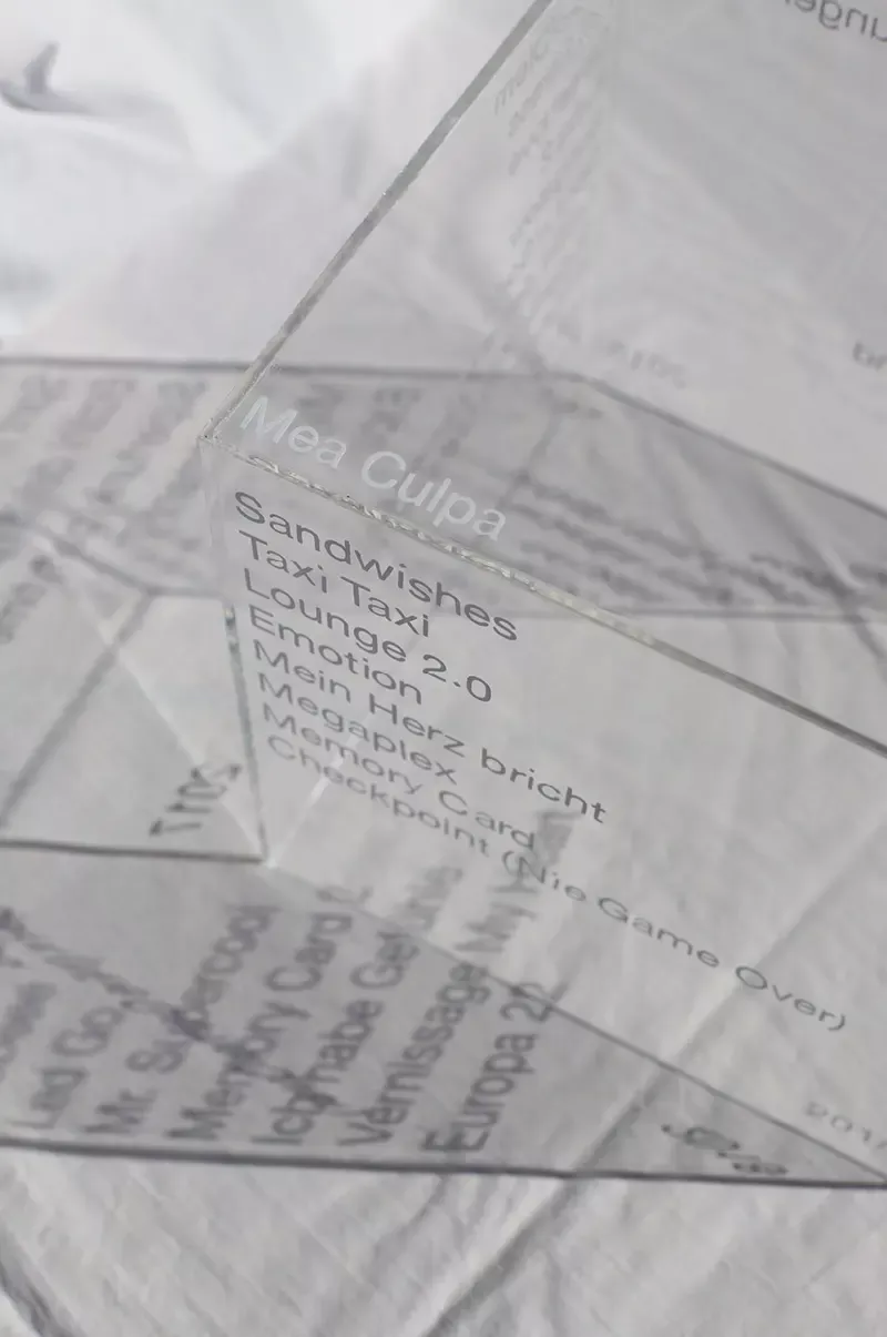
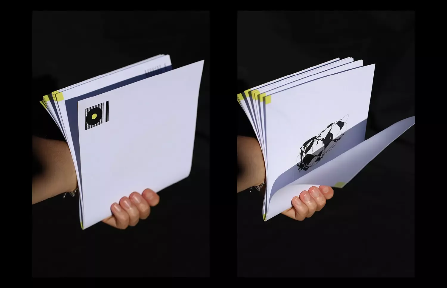
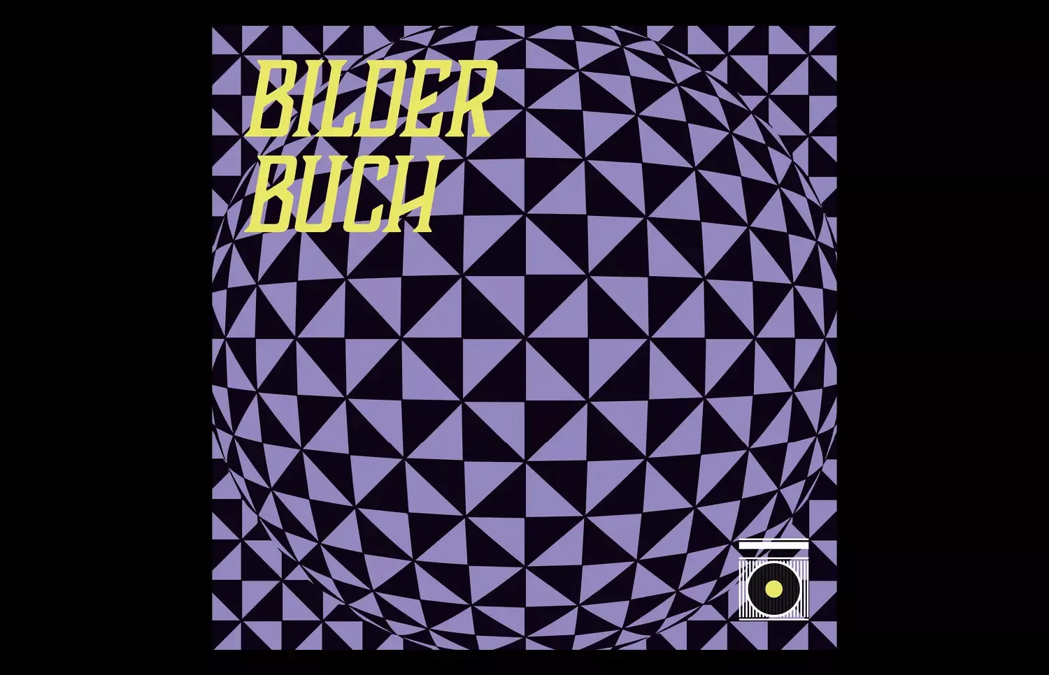
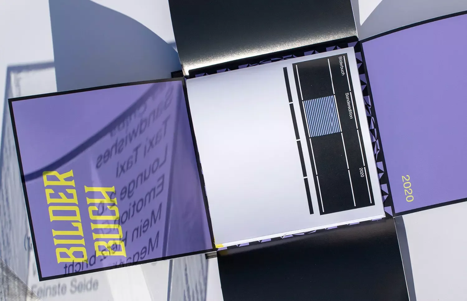
The special edition of the Austrian band Bilderbuch is divided into their four albums.
It conveys their experimental, direct, and always changing music creatively.
The transparent box reflects Bilderbuch’s unexpected actions and it provides visual insight into the core of the band/their music and gives a behind the scenes look at their values.
- Print, Experiment, Typography, Photography
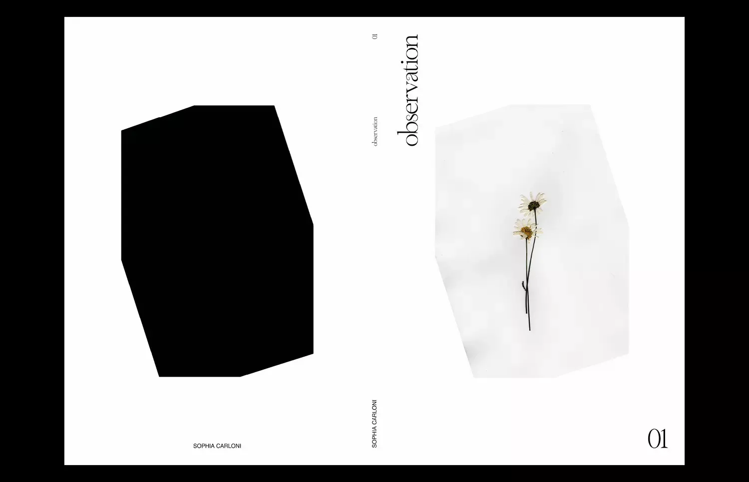
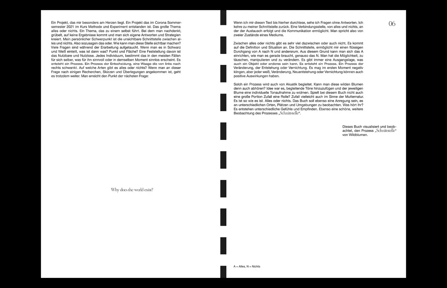
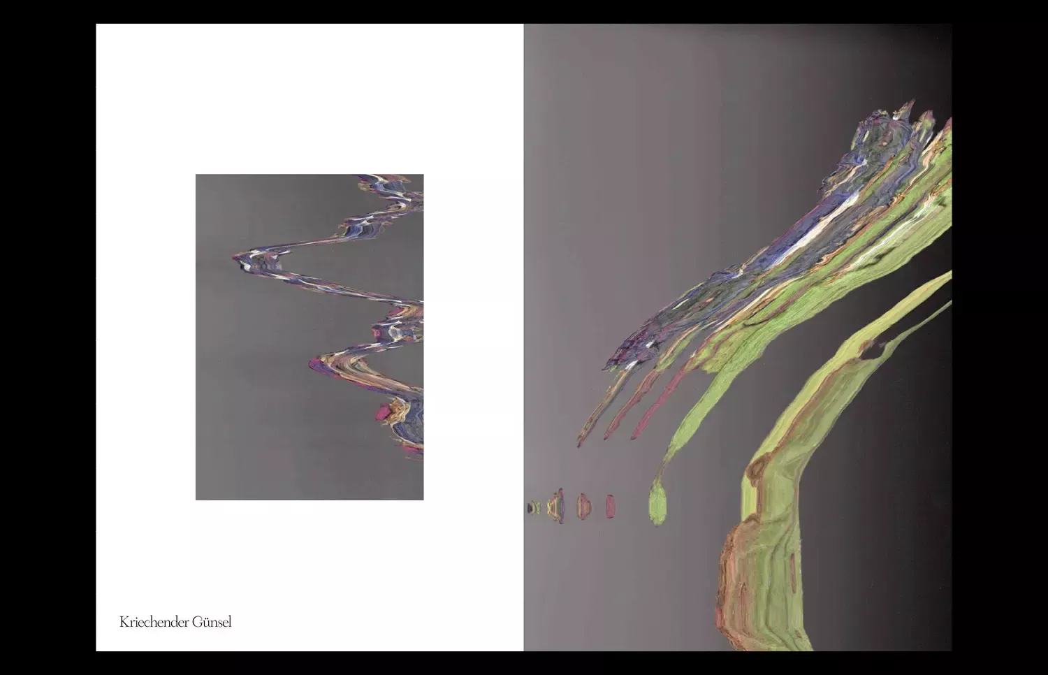
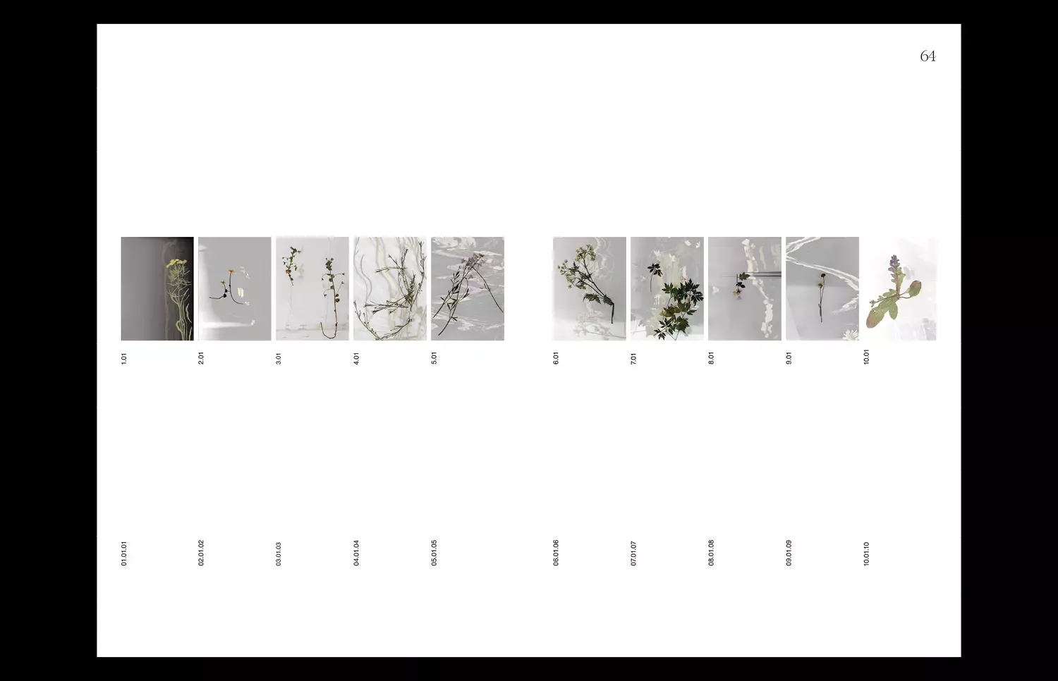
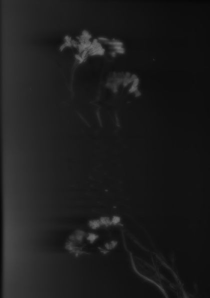
This book is about the interface between everything and nothing. It could be about the „or“, the „and“, or the „comma" in between. Either way, it's about the process.
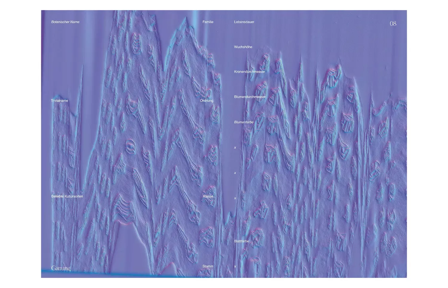
A process of change, of creation or annihilation. It is about the interface between the contrasts of everything and nothing. Time, observation, and patience play a big role in this publication. Through time intensive drying, pressing and blurry scanning of different wildflowers an illusion of movement and depth was created to visualize the search for the „in between“.
